12 App Store Screenshot Mistakes That Kill Your Conversion (2026)
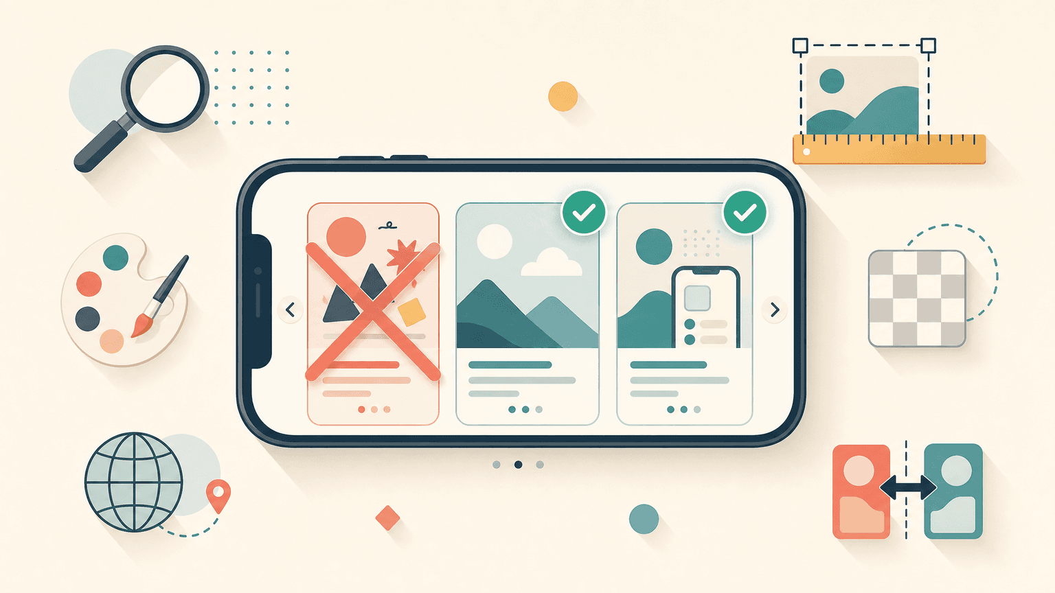
TL;DR. The most damaging App Store screenshot mistakes fall into two buckets: rejection-causing technical errors (alpha channel, wrong sizes, fake UI) and conversion-killing design errors (logo-only first frame, text overload, no captions, monotony, no localization, no A/B testing). Apple shows only the first 1 to 3 portrait screenshots in search results without scrolling, so the first frames carry most of the weight. Below are 12 mistakes, sorted by bucket, each with the fix.
Last updated: 2026-07-12.
Disclosure. We make ScreenFast, an AI App Store screenshot generator. It solves the production and design half of this list, not the strategy half, and we flag exactly where it helps and where judgment is needed.
Why App Store screenshots make or break the funnel (the two buckets)
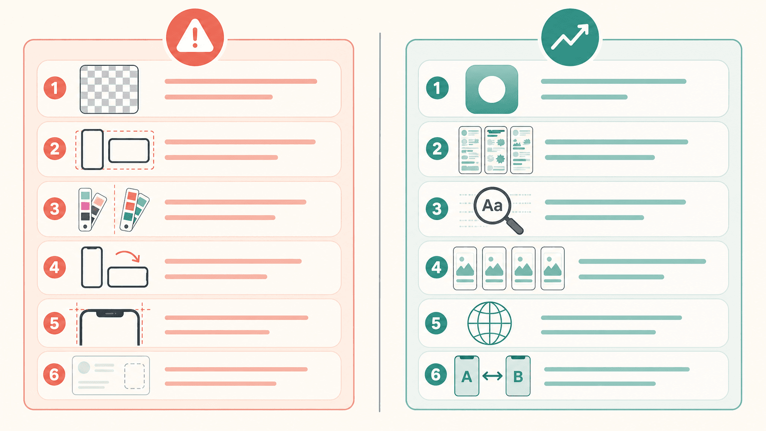
Every screenshot mistake costs you in one of two ways. Either Apple rejects the build, or the listing passes review and quietly loses installs. You have to clear both.
The stakes are concentrated up top. Apple shows only the first 1 to 3 portrait screenshots in iPhone search results before anyone scrolls (iPad shows 2, landscape shows 1), per MobileAction. Behavioral research repeated by AppsFlyer, originating from Phiture and StoreMaven, found users spend roughly 7 seconds on a product page and only about 9% scroll the screenshots. So your first frames do nearly all the work.
And most apps get this wrong. A SplitMetrics audit found 56% of analyzed screenshots fail to illustrate the value proposition, 40% have hard-to-read captions, and 37% are overcrowded. Avoiding the 12 mistakes below already puts you ahead of more than half the store.
App screenshots best practices: how to build app screenshots that convert is a solid visual primer before the list.
Mistakes 1 to 4: the technical errors that get you rejected
These do not hurt conversion. They stop your build from shipping at all.
Mistake 1: Alpha channel or transparency. Apple accepts only .png, .jpg, and .jpeg, and the image must be flattened with no transparency layer. A PNG exported with an alpha channel is a classic rejection, and it looks fine on your screen, so you do not notice until upload fails. Fix: export flattened, no alpha.
Mistake 2: Wrong size or color space. The 2026 base classes are the 6.9-inch iPhone (1290x2796, with some sources citing 1320x2868 for the iPhone 17 class) and the 13-inch iPad (2064x2752). Export in RGB; Apple rejects CMYK. Fix: build one correct RGB master and verify the exact pixels against Apple's screenshot specifications, since the tiers shift between releases. The full table is in our App Store screenshot sizes guide.
Mistake 3: Fake or misleading UI. Apple's Accurate Metadata rule wants the real app. Screenshots showing features the app does not have are the most common metadata rejection. Fix: screenshot real screens, then dress them with captions and backgrounds, never invent UI.
Mistake 4: Orientation mismatch. A portrait UI shown inside a landscape frame triggers a quality rejection. Fix: match the frame orientation to the actual app UI, and keep content inside the safe areas so the notch and rounded corners do not crop it.
One more review trap that bridges into conversion: Apple can flag superlative claims like "best," "#1," or "top-rated" as unverifiable. Keep overlay copy to honest benefits.
Mistakes 5 to 8: wasting your most valuable real estate
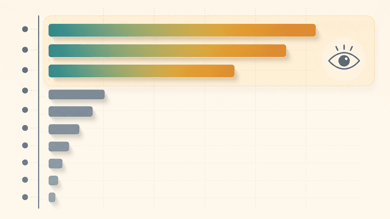
These pass review but bleed installs.
Mistake 5: Logo-only or splash first frame. Your first slot is the most valuable pixel real estate you own, and a logo, splash, or login screen says nothing. Fix: lead frame 1 with your single strongest benefit on a real UI shot. Which slot does what is covered in first vs second screenshot.
Mistake 6: Empty states and zero-data screens. Screenshotting a settings menu, a permission prompt, or an empty list makes the app look unused. Fix: populate every screen with realistic content before you capture, so it looks like a product people already love.
Mistake 7: Too much text or overcrowding. 37% of audited screenshots are overcrowded (SplitMetrics). Cramming a feature, social proof, and three lines of copy into one frame means the user reads none of it. Fix: one idea per frame, a 5 to 7 word headline.
Mistake 8: No captions at all. The opposite failure. A raw, unlabeled UI screenshot gives the browser no value framing. Nielsen Norman Group research (via AppsFlyer) notes users read only about 20% of text, and images paired with short text outperform bare images. Fix: add a short benefit caption to every frame.
On the perennial "how many screenshots" debate: Apple allows 1 to 10. The honest answer is to front-load the critical first 3, then fill the remaining slots with genuine feature depth rather than padding.
Mistakes 9 to 12: monotony, no localization, no dark mode, no A/B test
Mistake 9: All-same-style monotony. Most guides warn about inconsistency. The opposite is just as bad: 10 near-identical clone frames bore the scroll and blur together. Fix: a cohesive design system with real visual variety frame to frame, distinct colors and compositions.
Mistake 10: No localization. Screenshots appear in search results next to your app name in each market. A SplitMetrics case with ZiMAD reports a 36% conversion lift from Japanese localization (vendor data, directional). Fix: localize the screenshot images, not just the metadata; the localization guide covers the workflow.
Mistake 11: Ignoring dark mode. Over 50% of users use dark mode regularly (AppTweak), and all-dark frames can also blend together and read heavy. Fix: check legibility in both light and dark App Store appearances, and do not ship an all-dark set without testing contrast.
Mistake 12: Never A/B testing. Shipping one design and never iterating leaves the biggest gains on the table. SplitMetrics case studies report lifts like SKODA +15% and Prisma about +20% from testing App Store images; AppQuantum reports +21.5% via creative testing. Fix: run hypothesis-driven tests in App Store Connect Product Page Optimization. The mechanics are in the A/B testing guide. Honest framing: the lift comes from testing, not from any one tool, and no screenshot guarantees higher conversion.
| Mistake | Bucket | Wrong way | The fix |
|---|---|---|---|
| Alpha channel / transparency | Rejection | PNG with a transparency layer | Export flattened, no alpha; PNG or JPEG |
| Wrong size / color space | Rejection | Odd dimensions or CMYK | One correct-size RGB master, auto-scaled |
| Fake or misleading UI | Rejection | Showing features the app lacks | Real screens only, then add captions |
| Orientation mismatch | Rejection | Portrait UI in a landscape frame | Match frame to actual app orientation |
| Logo-only / splash first frame | Conversion | Frame 1 is a logo or login | Lead with the strongest benefit |
| Too much text / overcrowding | Conversion | Everything crammed in one frame | One idea per frame, 5 to 7 word caption |
| All-same-style monotony | Conversion | 10 near-identical clone frames | Cohesive system with real variety |
| Never A/B testing | Conversion | Ship one design, never iterate | Test in App Store Connect PPO |
How we tested
The 12-item list cross-references Apple's official screenshot specifications with five ASO references (SplitMetrics audit data, AppTweak, theapplaunchpad, DesignMonks, MobileAction). Every Apple spec is cited to developer.apple.com; every statistic is attributed to its named vendor. Vendor case studies (SKODA +15%, Prisma +20%, ZiMAD +36%) are vendor-published and directional, not independently audited. We present the first-frame weight as a range of roughly 50 to 70% because sources report it differently, and we flag that the 7-second and 9%-scroll behavioral figures trace to older Phiture and StoreMaven research (an AppsFlyer write-up dated 2022), so treat them as directional. We did not fabricate any numbers or quotes.
Fixing the design mistakes fast (where a generator helps and where it does not)
Several mistakes above are production problems, and a generator removes them mechanically. This is the one place our tool fits.
ScreenFast starts with a free audit of a live App Store URL or uploaded prelaunch screens. After the $9.99 one-time checkout, it generates 10 design directions on a 1290x2796 iPhone canvas. That gives you alternatives to compare without claiming that AI output is automatically store-ready. Review every caption, UI detail, and claim before submission. iPad export and localization are separate workflow decisions, not part of the base iPhone pack.
The carve-outs matter as much as the features. ScreenFast does not make App Store preview videos, does not decide your value proposition or keyword strategy, and its canvas editor refines visuals rather than freeform text. Those are the strategy mistakes (1, 3, 5, 8) you still own. See the AI App Store screenshot generator for the production half, and the conversion benchmarks for what good looks like.
For a release-wide review beyond the image files, use the App Store listing optimization checklist for current Apple metadata limits, compliance checks, localization, and Product Page Optimization.
If App Store Connect rejects a technically valid-looking file, use the screenshot upload error troubleshooting order to separate locked metadata, file validation, processing, and API failures.
The pre-upload checklist (recap)
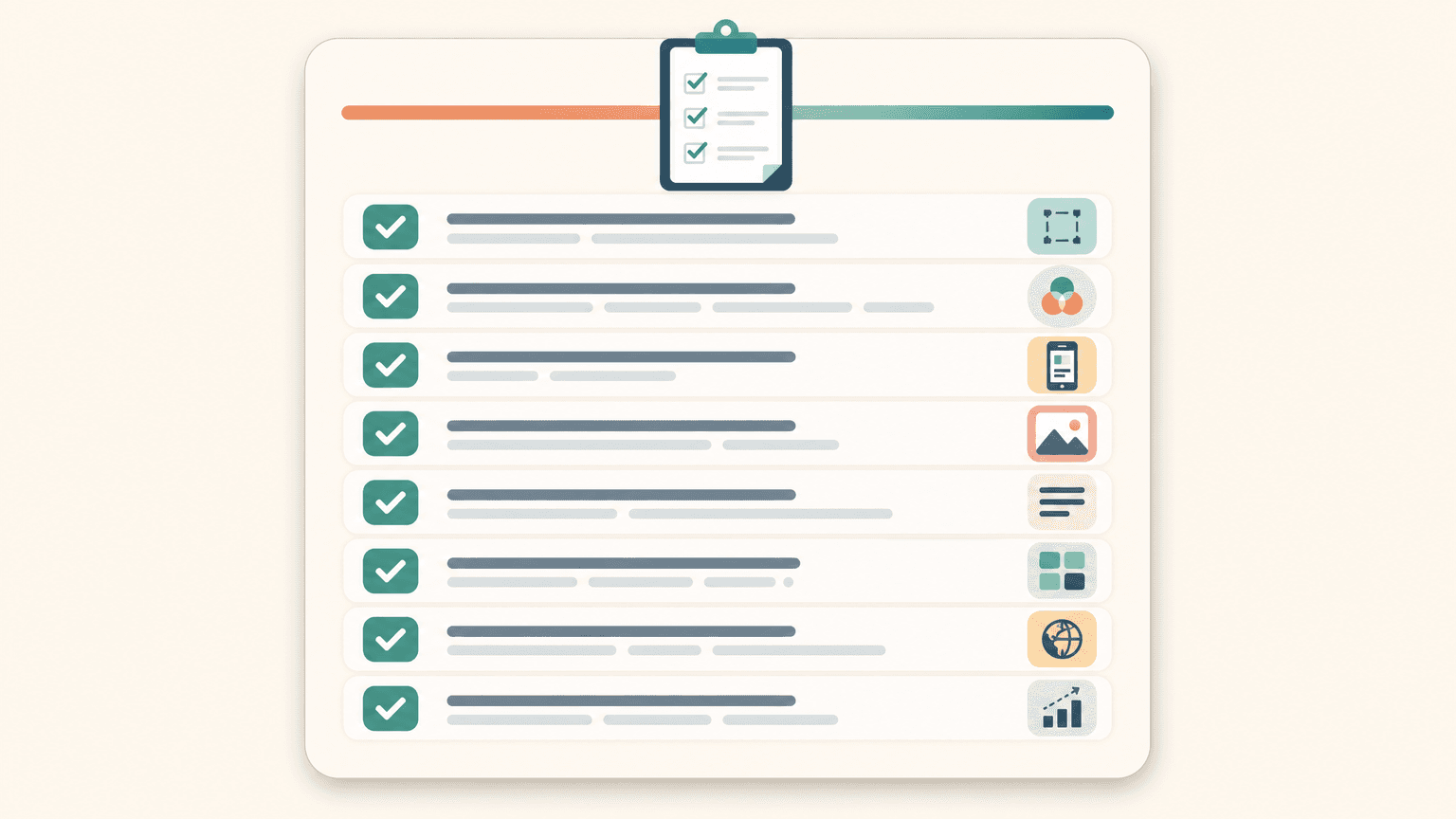
Technical pass: PNG or JPEG only, RGB with no alpha (flattened), correct 2026 pixel size verified against App Store Connect, real UI only, orientation matches the app, content inside safe areas.
Conversion pass: strongest benefit on frame 1, no splash, login, or empty states, one idea per frame with a 5 to 7 word caption, cohesive but varied styling, a localized set, and legibility checked in both light and dark.
Slot strategy: front-load the first 3 frames, use remaining slots up to 10 for feature depth, do not pad with filler. Always have at least two design directions queued so you can A/B test instead of shipping one and hoping.
FAQ
How many screenshots should I upload to the App Store?
Apple allows 1 to 10 per device per localization. Use all 10 slots if you have genuine depth, but front-load the critical first 3, since most users never scroll past them.
What are Apple's rules for promotional and marketing text in screenshots?
Apple allows text overlays, but flags unverifiable superlatives like "best" or "#1," and you cannot show features the app lacks. Keep overlay copy to honest, demonstrable benefits.
Should I include text in my App Store screenshots?
Yes. Bare UI screenshots underperform. A short benefit caption (5 to 7 words) on each frame gives the browser value framing, since users skim and read only a fraction of any text.
Should I localize screenshots for different countries?
If you have meaningful traffic in non-English markets, yes. Localized screenshots appear in local search and can lift conversion materially (one vendor case reports +36% for Japanese). Localize the images, not just the metadata.
How do I A/B test App Store screenshots?
Use App Store Connect Product Page Optimization to run up to three alternate sets against your original with a traffic split. Change one variable at a time and let it reach significance before promoting the winner.
Can I use the same screenshots for the App Store and Google Play?
Not directly. The size requirements and aspect ratios differ, and Google Play permits promotional framing the App Store does not. Re-export per store.
What image format and size does Apple require?
PNG or JPEG, RGB, no transparency, at an accepted device size (the 6.9-inch iPhone master is the primary 2026 slot). Verify exact dimensions in App Store Connect before submitting.