Subscription App Store Screenshot Examples Without Misleading Buyers
TL;DR
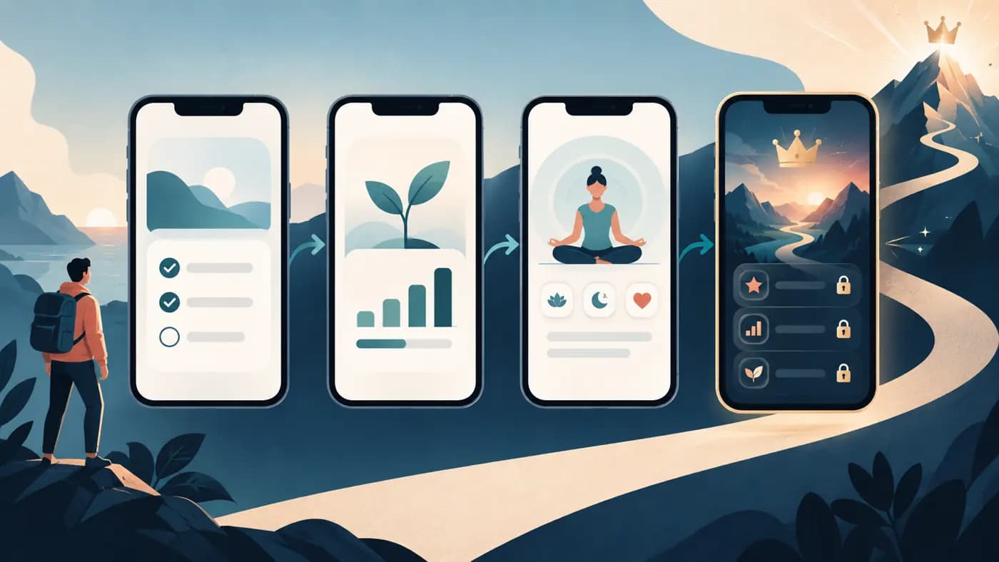
For a subscription app, App Store screenshots have two jobs: show a compelling outcome and make the boundary between included and paid features clear. Apple's App Review Guideline 2.3.2 says screenshots and previews must clearly indicate when featured items, levels, or subscriptions require additional purchases. Do not label a paid coaching feature as free, imply a locked screen is generally available, or hide the actual app behind aspirational art. Below are original storyboards, not real-app examples or tested conversion winners.
These subscription App Store screenshot examples concern listing images, not paywall design, subscription pricing law, or a claim that the App Store requires a paywall screenshot. The store images should accurately set expectations; the in-app purchase flow must be reviewed separately. Apple's asset guidance and review rules are the primary source for the listing advice.
The trust problem: what can I do before I pay?
A vague screenshot such as "Unlock your best self" tells a buyer neither what the app does nor what a download includes. A stronger set shows a real action, a real result or experience, and an honest qualifier when a highlighted capability belongs to a paid tier. You can be persuasive without making the subscription a surprise.
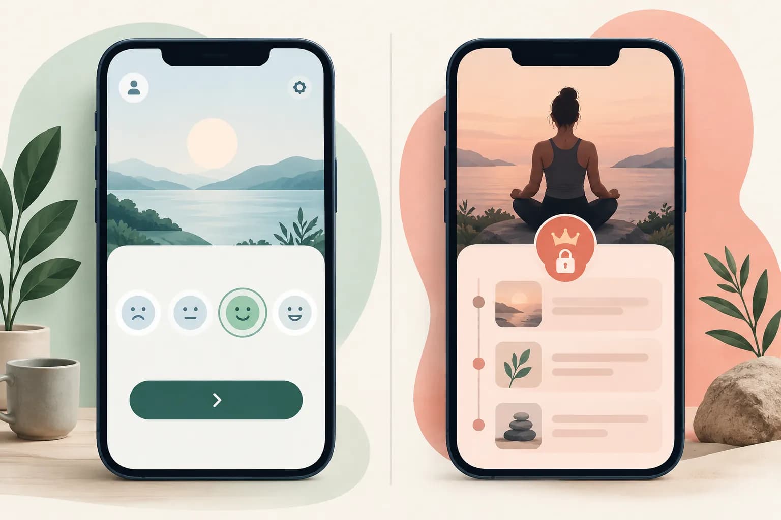
The illustration is a fictional interface. Its useful lesson is the visible boundary: a buyer can see what they can do now and which showcased experience requires payment. In your actual listing, use captures from your released build and the names of your real plans.
Before designing, write down three lists: features available without paying, features available only during a trial or paid period, and features that vary by plan. Mark every proposed screenshot with the list it belongs to. If a feature spans tiers, decide which exact state the displayed UI depicts. This simple inventory prevents a headline written for a premium screen from drifting onto a free screen.
| Weak or ambiguous caption | More specific alternative | Check in the app |
|---|---|---|
| "Everything you need, free" | "Start with a free daily check-in" | Is that check-in genuinely available without a purchase? |
| "Your personal coach" | "Personal coaching with Premium" | Does Premium actually include the depicted coaching? |
| "Unlimited lessons" | "Unlock the full lesson library with Plus" | Are the amount and plan name accurate in every locale? |
| "Track all your progress" | "See your weekly activity" | Is the shown history included in the depicted tier? |
These are editorial rewrites, not approved legal language or promises of better performance. If you cannot substantiate the more specific version, remove the claim.
Run a claim-to-access audit
Make a small inventory before anyone opens a design tool. Use four columns: proposed caption, screen shown, access required, and the person who checked it in the current build. A designer may know how the page should look but not which plan controls a feature. A product owner may know the plan but miss that the caption silently broadens it.
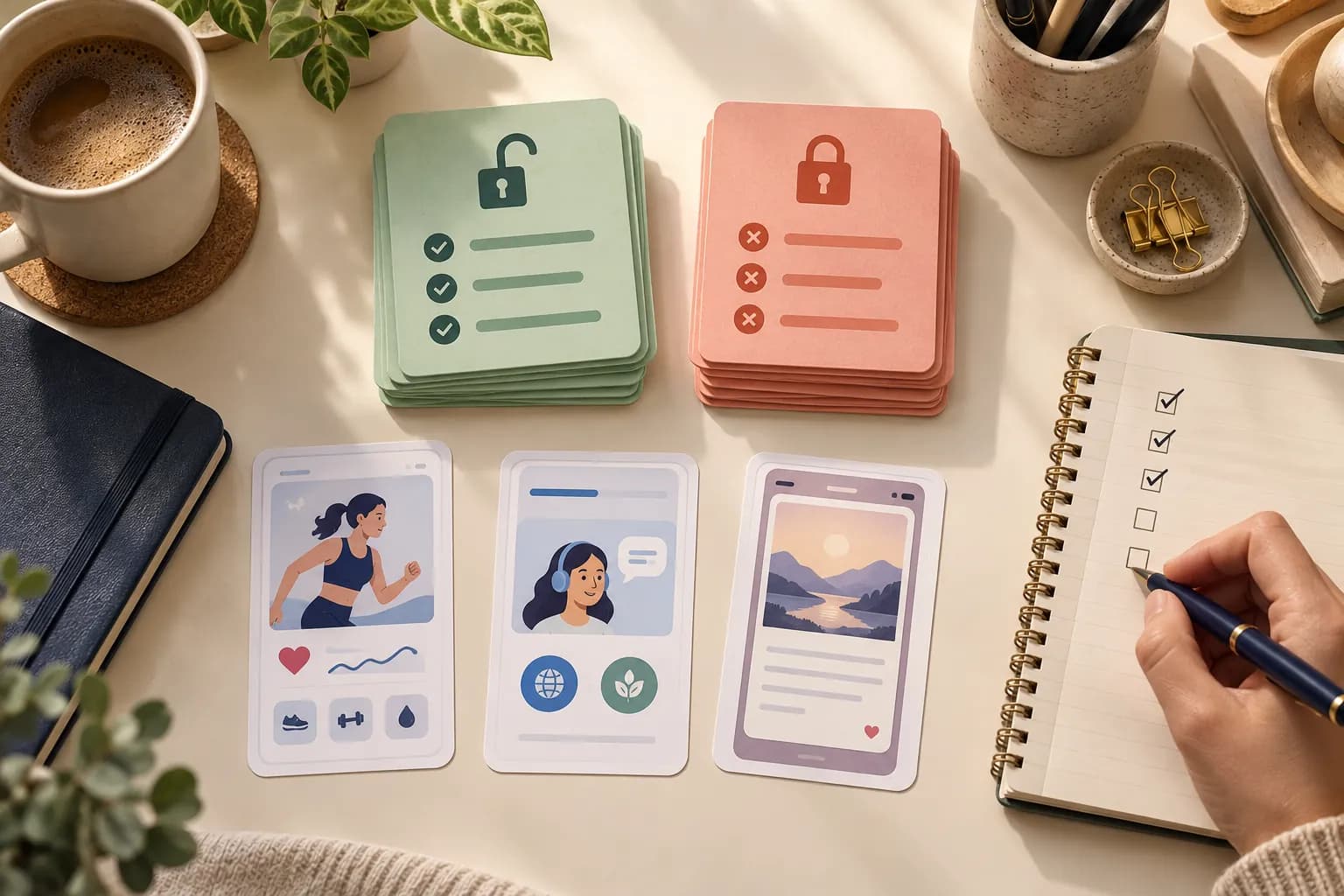
For the fictional fitness app below, an inventory might read: "See your workout history" / history screen / available without payment / verified in the current build. The next row might read: "Follow a guided training plan with Pro" / plan screen / Pro entitlement / verified in the current build. If a free trial temporarily unlocks Pro, record that as trial access, not as a permanently free feature. This exercise also reveals when a screenshot shows an empty or exceptional state rather than the normal first-run experience.
Repeat the check for each localization. A translated plan name, an outdated offer, or a changed feature gate can make a once-correct image misleading. Keep the approved caption and the exported file together so a future pricing update has a clear place to start. This is a publication control, not a substitute for reviewing the purchase flow or getting legal advice where needed.
A six-frame storyboard you can adapt
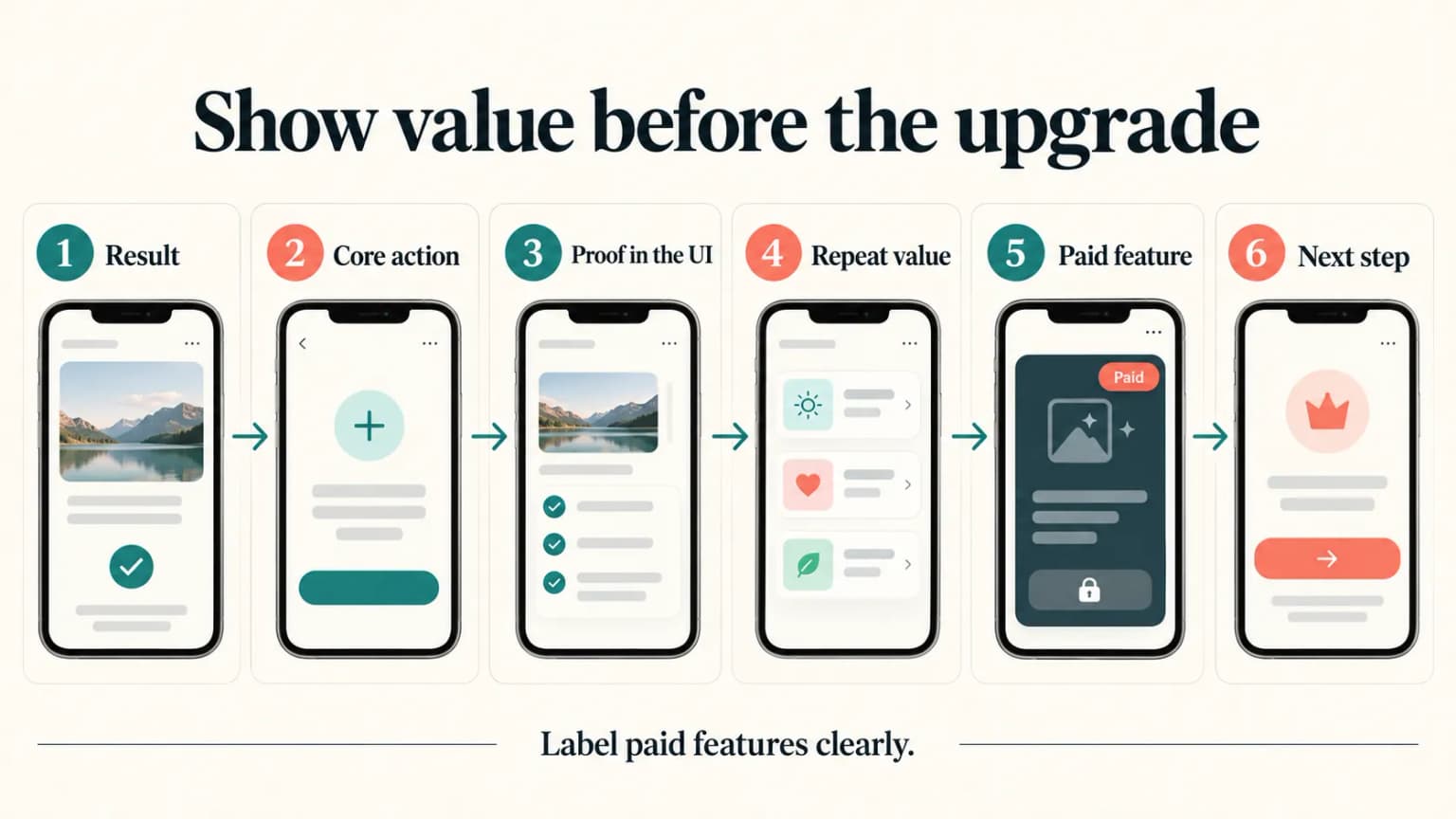
Frame 1: outcome. Lead with a concrete user benefit supported by real app UI: "Build a routine you can return to." Show the check-in, plan, lesson, or workspace that makes the benefit plausible. Avoid suggesting a guaranteed health, income, or learning outcome.
Frame 2: first useful action. Show the action a new user can take immediately. If this is in the free tier, say so accurately; if it requires a trial, do not call it permanently free. The purpose is to remove ambiguity about what happens after download.
Frame 3: differentiated experience. Show the feature that makes the product distinctive. If that feature requires a subscription, label the screenshot clearly, for example "Premium feature" or your actual tier name. Don't rely solely on a tiny lock icon buried in the UI.
Frame 4: ongoing value. Show a repeat-use loop: progress, saved work, next lesson, or a plan adapting to prior activity. This must be a real state the app can display, not an invented data visualization.
Frame 5: scope of the paid offer. If the listing features several paid benefits, group them with precise, readable language and actual UI proof. You need not place a full price card in a screenshot, but the user should not mistake paid benefits for unrestricted free access.
Frame 6: reassurance or next step. Use one meaningful proof point such as device continuity or a completed workflow, only if it exists. Do not fill the last frame with ratings, awards, or testimonials you cannot verify. A short set can be better than six repetitive images.
Apple permits up to ten screenshots in each applicable slot; six is an editorial structure, not an Apple requirement. The official screenshot specifications control dimensions, formats, and device coverage. Apple's search page says up to three images or previews may appear in some search layouts, so the disclosure should not be deferred to an image a searcher might never see.
Example: a fitness subscription
Assume a fictional fitness app provides a basic workout log without payment and guided training plans with a paid "Pro" tier. This is an illustrative product assumption, not a real app or a recommendation to structure your tiers this way.
One honest set could open with "See every session in one place" over the actual free log. A second frame could show the workout recording flow. The third might say "Follow a guided plan with Pro" over an actual plan UI. A fourth could show progress history if available. The fifth could explain what Pro adds, with the same tier name the product uses. If a coaching feature exists only in a higher tier, don't place it in the general Pro frame.
Avoid an implied guarantee like "Get fit in 30 days" unless you have an appropriate basis and have considered the relevant review and advertising rules. The screenshot can show a habit-supporting workflow without promising an outcome.
Example: a language-learning subscription
Suppose a fictional learning app offers a limited set of lessons free and a larger library through Plus. Show the real lesson interaction first. If the third frame shows a premium speaking exercise, label it "Speaking practice with Plus" rather than "Speak fluently fast." Show the actual exercise state, not a stock photo of a person talking.
The main buyer question is usually whether the app helps them practice in a way they enjoy. A screenshot of a genuine exercise and a concise benefit may answer it better than a list of every grammar topic. Keep the premium boundary visible wherever a premium-only exercise is featured.
Example: a journaling subscription
A journaling app may offer basic entries free and advanced prompts or insights on a subscription. "Keep your thoughts in one private place" could lead if the shown editor and privacy claim are supported by the product. "Explore guided prompts with Premium" could introduce paid guidance. If the app does not offer end-to-end encryption, don't use a lock graphic or "only you can read it" wording that implies it does.
For sensitive products, demonstration entries should avoid real personal data. The visual needs enough detail to prove the app's flow without exposing an actual customer's journal.
Choose an opening order that fits the offer
A free-first sequence opens with an immediately usable action, then reveals what the subscription adds. It suits a product with a meaningful free mode. A premium-first sequence can make sense when the paid experience is the main product, but the featured screen must be marked clearly as paid from the start. Neither order is a universal winner, and neither can hide an access condition until the last frame.
Make two paper storyboards before designing the final images. Keep the same app captures, caption length, and paid label; change only the opening order. Show each draft at phone size to someone who has not seen the app. Ask: "What can I do after download?" and "What needs payment?" If the answers are wrong, clarify the frame before testing conversion. This checks understanding. A small review group cannot estimate install lift.
Design and test without hiding the qualifier
Keep the paid label close to the relevant feature claim, legible at a phone-sized preview, and consistent across translations. If you rearrange screenshots for a localized page, check that the label still travels with the correct screen. If a plan name changes, update every frame that mentions it. The localization guide covers practical text and export checks.
Test a meaningful story change if you have enough eligible traffic. For example: does leading with the free useful action clarify the product better than leading with a paid feature? Apple's Product Page Optimization can compare eligible default-page variants; it cannot establish that an inaccurate claim is acceptable. The A/B testing guide explains the tool, and our copywriting examples can help shorten a wordy caption.
ScreenFast is our product. Its screenshot generator can give you multiple visual directions after a free audit, but the generator does not know your live entitlements or legal obligations. A human with access to the actual app and offer must verify the images, tier names, and export files before upload.
Methodology
We checked Apple's live App Review Guidelines, especially sections 2.3.2 and 2.3.3, plus the App Store asset and screenshot-specification pages on 2026-09-24. The fitness, learning, and journaling products above are invented teaching examples. We have not measured their conversion or claimed that a six-frame set outperforms another count. Advice about readability and sequence is editorial inference from the listing context, clearly separate from Apple's documented requirements.
The new UI and planning visuals are fictional editorial illustrations. They are not captures of a released product or evidence of a measured result.
FAQ
Must a subscription app show its paywall in an App Store screenshot?
Apple's cited screenshot rule requires clear indication when featured content or subscriptions need an additional purchase. It does not say every subscription app must show a paywall screen in the listing. Show accurate app UI and label paid features clearly.
Can I show a premium feature before a free feature?
Yes, if the listing does not mislead a buyer about access. Label the paid feature prominently. Whether that order helps your audience is a testable creative question, not a universal rule.
Is "free trial" the same as "free"?
No. A trial is time-limited and may have eligibility or billing terms. Avoid a screenshot caption that turns trial access into a promise of permanent free use.
How many screenshots should I include?
Apple permits one to ten per applicable device slot. Include the frames needed to explain the real experience and paid boundary. Don't add filler to reach six.
Can I use stylized mockups instead of actual app screens?
Apple's 2.3.3 guidance says screenshots should show the app in use. Stylization can frame the UI, but don't replace the app with conceptual artwork or depict unavailable features as shipped.
Last updated: 2026-09-24.