App Store Screenshot Typography Best Practices: A Readable Type Scale (2026)
TL;DR
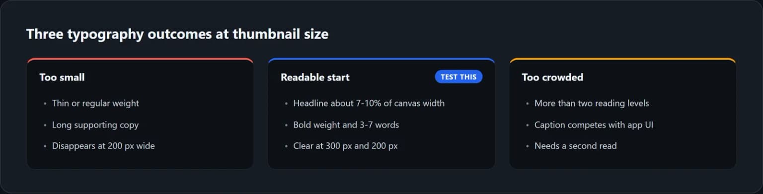
Start an App Store screenshot headline at about 7% to 10% of the canvas width. On a 1290 px-wide iPhone master, that is roughly 90 to 129 px. Use a bold weight, keep the promise to 3 to 7 words, and use no more than two lines. Supporting text can start around 4% to 5% of the width, but it should never carry the only important claim. Preview the whole frame at 300 px wide, then stress-test the first screenshot at 200 px. Apple does not publish a minimum caption font size, so treat this scale as a tested starting point, not an App Store rule.
These App Store screenshot typography best practices are for marketing captions around your captured interface. Text inside the app UI follows a different system.
Disclosure. We make ScreenFast. The guide teaches the typography decision first and mentions our product only where it can apply the finished direction.
What Apple specifies, and what designers must decide
Apple specifies the asset container. Its current screenshot specifications allow 1 to 10 screenshots in JPEG, JPG, or PNG, with no alpha channel. The 6.9-inch iPhone slot accepts several portrait sizes, including 1260x2736, 1290x2796, and 1320x2868.
Apple also explains where the sequence matters. When no app preview is present, the first one to three screenshots can appear in search results. Its product page guidance recommends using those frames to show the essence of the app and focusing each later frame on one main benefit or feature.
Apple does not specify an App Store screenshot caption font size, typeface, line height, or safe margin. A claim such as "Apple requires 72 px headlines" is therefore false. The store defines the canvas and content rules. You define the overlay typography and validate it in the context where people will see it.

Use a relative type scale, not a magic pixel number
A fixed pixel recommendation only makes sense when it names the canvas. A 72 px headline occupies 5.6% of a 1290 px-wide screenshot, but 3.5% of a 2048 px-wide iPad canvas. Those are visibly different treatments.
Use width as the common denominator. It keeps the hierarchy consistent when the export size changes and makes every recommendation auditable.
Think of the table as a 1290x2796 screenshot text size reference, not a platform specification. The right screenshot headline font size is the smallest size that preserves instant scanning under the thumbnail test for your chosen face and copy.
| Role | Starting scale | 1290 px canvas | Practical constraint |
|---|---|---|---|
| Primary headline | 7% to 10% of width | 90 to 129 px | 3 to 7 words, one or two lines |
| Supporting line | 4% to 5% of width | 52 to 65 px | One short line, optional information only |
| Small label or chip | 3% to 4% of width | 39 to 52 px | Decorative or redundant, never the core claim |
| Side margin | 6% to 9% of width | 77 to 116 px | Keep the caption clear of edges and device art |
This is a starting scale, not a promise that every font will look identical. A condensed face, a high-contrast serif, and a geometric sans can have the same numeric size but very different apparent size. Set the headline first, inspect it at thumbnail scale, and adjust optically.
The 200 px App Store screenshot thumbnail test
We rendered the same 1290x2796 composition with the same copy and bold typeface at five headline sizes: 64, 80, 96, 112, and 128 px. We then downscaled each master to exactly 200 px wide with high-quality resampling.
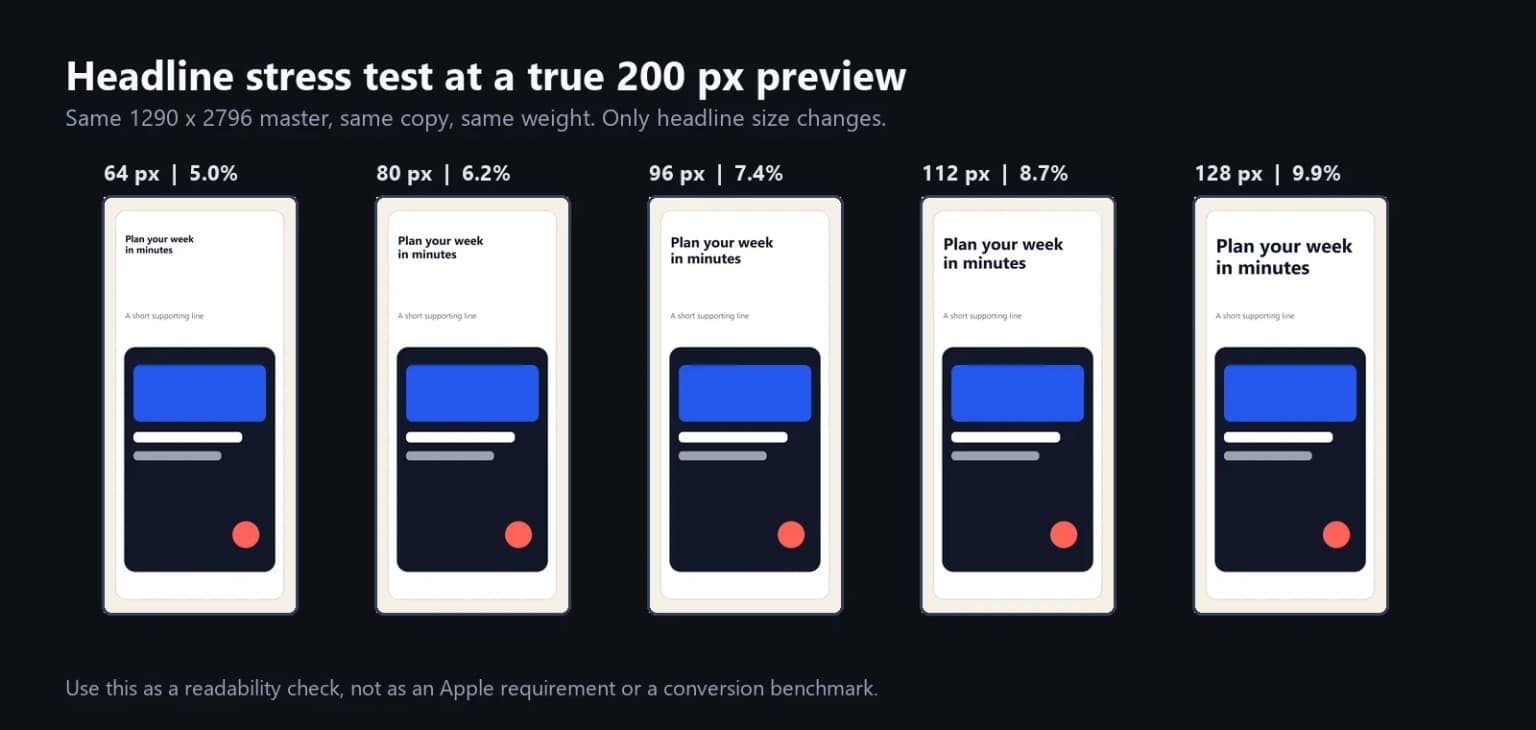
The 64 px and 80 px versions remain technically decipherable because the sample uses short copy, a bold face, and near-perfect contrast. They still lose presence and demand more attention. At 96 px and above, the headline becomes much easier to scan. That is why 7% to 10% of width is a useful starting range.
Notice what happens to the supporting line. Even at 52 px on the master, it becomes weak at 200 px. This is not a reason to make every line huge. It is a reason to make the headline complete. A person should understand the benefit even if the subtitle disappears.
Run two previews before export:
- 300 px gallery preview. Check the full sequence and confirm that all headline roles feel consistent.
- 200 px search stress-test. Check the first frame and, when relevant, the first three. The promise must read instantly without zooming.

The 200 px width is a repeatable stress-test, not a guarantee that every App Store surface renders at exactly that CSS width. Its value is consistency. You can compare every version under the same harsh condition.
A practical copy-and-size pass
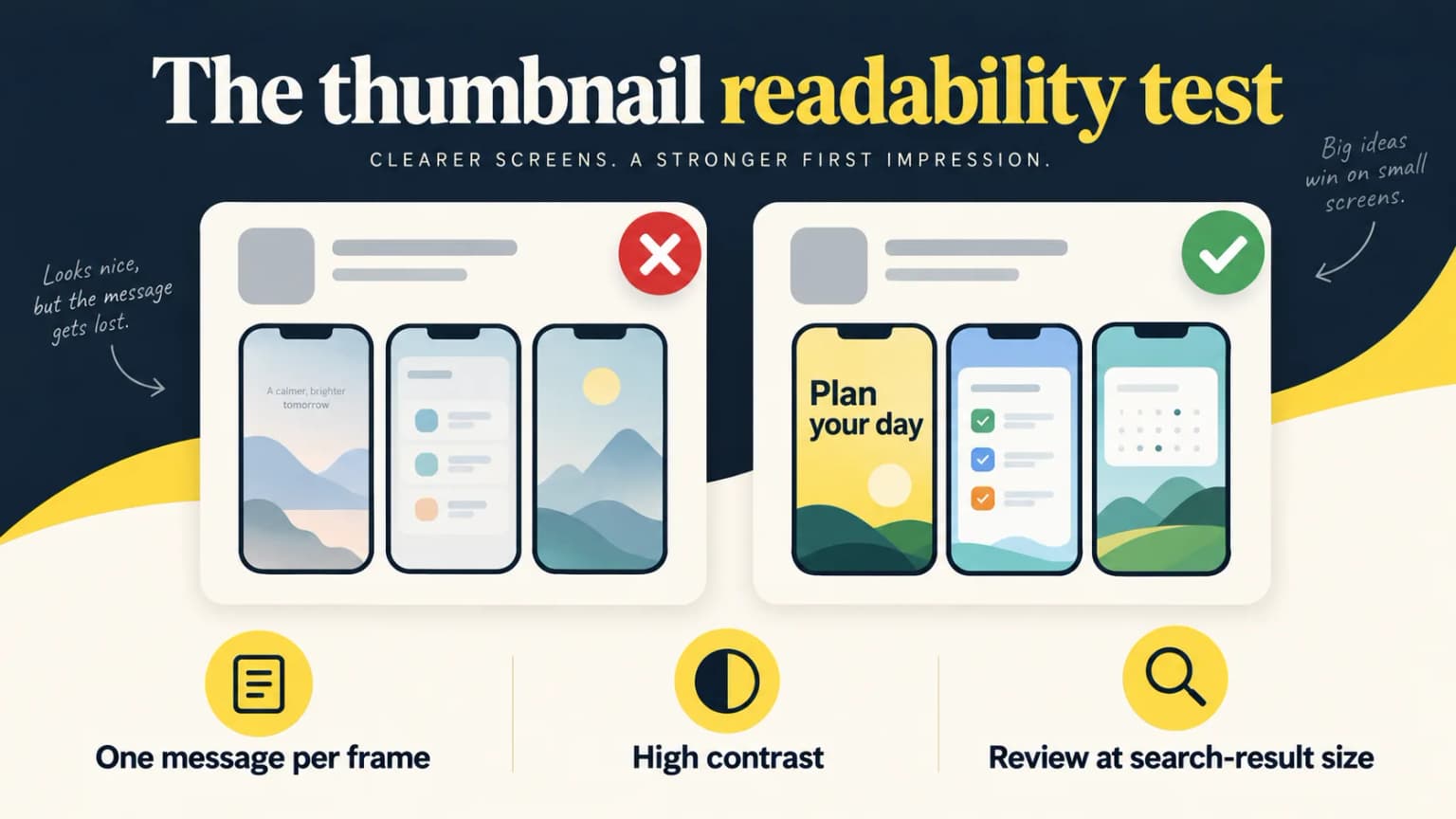
Keep the captured UI and background identical while changing only the headline. Compare a feature label such as "Task Calendar" with an outcome such as "Plan your day." Export both at the same 1290x2796 dimensions, reduce them to the same 200 px width, and ask someone unfamiliar with the app what each image promises. If they cannot answer from the first frame, rewrite the copy before enlarging it. This is a comprehension check, not evidence that one version will convert better; use a product-page test for that.
Repeat the pass after localization. A German compound, Arabic joining, or a CJK line break may require different line length and optical size even when the numeric font size is unchanged. Keep screenshots as images of the actual app, and review the displayed localized UI as well as the caption.
Build an App Store screenshot text hierarchy that scans once
A screenshot is not a miniature landing page. Give each text level one job:
- Headline: state the benefit or outcome. "Plan Your Week Faster" works without the subtitle.
- Supporting line: add a constraint, audience, or mechanism. "Tasks, calendar, and notes in one view" adds detail.
- Label: provide optional context such as "New" or "For Teams." If it vanishes, the frame still works.
- Captured UI: prove the promise. It should not fight the marketing caption for first attention.
Keep one dominant level and one supporting level on most frames. Use one type family with two weights before introducing a second family. A headline at 700 or 800 and a supporting line at 400 or 500 is usually enough separation.
Public developer critiques use blunt but useful language. One reviewer saw "waaay too much text", while another said the "description text is unreadable". A more recent workflow thread explained that "hand-tuned sizes looked fine until I reworded a caption". These are field anecdotes, not conversion benchmarks. They still expose the two common failure modes: too much copy and a layout that breaks as soon as the copy changes.
For the words themselves, lead with an outcome instead of a feature label. "Split Bills in Seconds" is more useful than "Expense Splitting." The App Store screenshot copywriting examples provide formulas and category examples, while the first screenshot guide covers message order.
Choose App Store screenshot fonts by shape and license
The best fonts for App Store screenshots are not defined by trend. They survive reduction. Look for a high x-height, open counters, sturdy stems, and enough weights to create hierarchy without adding another family.
For a neutral starting point, Inter is practical. Its official repository describes a tall x-height and ships it under the SIL Open Font License. The Open Font License permits commercial use in artwork and other visual assets, subject to its terms. For multilingual work, Noto provides open-source families across many scripts.
Useful category directions include:
- Productivity, utilities, and developer tools: Inter, Manrope, DM Sans, or another sturdy sans.
- Editorial, finance, or premium lifestyle: a display serif for the headline, paired with a neutral sans for support.
- Fitness and sports: a wide bold sans or controlled condensed face with open counters.
- Games: a genre-specific display face can work, but test every letter at the real thumbnail size.
What about SF Pro in App Store screenshots?
Do not treat SF Pro as a generic free marketing font. Apple's current SF Pro license permits it for creating user-interface mockups for software that runs on Apple platforms and includes showing that UI in screenshots, images, or mockups. The same license restricts unrelated artwork and website use.
For teams comparing SF Pro App Store screenshots with an open font, separate the captured interface from the promotional overlay. The UI depiction and the marketing headline can have different licensing contexts and different typographic jobs.
That distinction matters. A faithful depiction of your Apple-platform UI is within the described purpose. A large promotional caption floating outside the UI may not be. If the use is ambiguous, review the current license or choose an open-licensed font. This is a licensing caution, not legal advice.
Set contrast for the reduced image, not the master file
Contrast that looks acceptable at 1290 px can collapse after resampling. Thin strokes soften, gradients compress, and app UI adds visual noise.
App Store screenshot contrast should be judged on the reduced raster, not only in the full-size design file.
Use the WCAG text contrast ratios as a conservative design proxy. WCAG 2.2 calls for 4.5:1 for normal text and 3:1 for large text. A rasterized marketing screenshot is not the same as live accessible text, so passing a ratio does not make the asset WCAG-compliant. Still, targeting at least 4.5:1 for important screenshot captions creates useful safety headroom after downscaling.
Three practical fixes solve most failures:
- Put the caption on a calm solid area or a controlled gradient.
- Add a subtle plate, blur, or darkening layer behind text when the UI is busy.
- Test in grayscale. If the hierarchy disappears without color, the tonal contrast is too weak.
Avoid using an entire screenshot as an award badge, testimonial, or call to action. Apple's asset best practices emphasize showing the app experience and communicating its value. Let the UI remain evidence, not decoration.
Localized App Store screenshot fonts need a flexible system
Localization changes line length, word shape, reading direction, and visual density. Do not lock a text box to the English width and reduce every translated headline until it fits.
Build the layout around constraints:
- Allow two headline lines in every locale, even if English uses one.
- Set a maximum line count before you set a minimum font size.
- Rewrite the localized benefit instead of forcing a literal translation.
- Use a font with native glyph coverage for the target script.
- Mirror alignment and composition for right-to-left languages such as Arabic and Hebrew.
- Review each locale at 300 px and 200 px, not only on the master canvas.
Noto families are a useful baseline for Chinese, Japanese, Korean, Arabic, and other scripts, but a shared family name does not remove the need for optical review. CJK glyphs can feel denser than Latin at the same numeric size. Arabic joins and diacritics need enough vertical room. Choose the local font first, then tune size, line height, and frame composition.
The complete production workflow is in our App Store screenshot localization guide. Current iPhone dimensions and accepted upload formats are covered in App Store screenshot sizes for 2026.
Keep typography consistent across the screenshot sequence
Apple lets you upload up to 10 screenshots, but the gallery should feel like one system. Create tokens before designing individual frames:
| Token | Lock across the set | Change only when needed |
|---|---|---|
| Headline | Family, weight, line height, default scale | Size for an unusually long localized phrase |
| Support | Family, weight, color role | Omit when the headline is complete |
| Caption zone | Side margin and top alignment | Shift to protect important captured UI |
| Background | Contrast logic and palette | Accent color tied to a feature group |
| Device art | Frame style and shadow | Crop or angle for a deliberate narrative beat |
Consistency does not mean every frame is identical. It means a person can predict where to look. If the first screenshot uses a large top-left headline, the second should not hide its main claim in a tiny centered label.
How we tested
We separated platform facts from design heuristics. Apple Developer documentation supplied the accepted formats, dimensions, screenshot count, search-result behavior, and Product Page Optimization workflow. W3C supplied a conservative contrast reference. The Inter, Noto, and Apple font sources supplied licensing context.
For the size recommendation, we created a 1290x2796 reference composition with identical copy, weight, layout, and contrast. We changed only the headline size across 64, 80, 96, 112, and 128 px, then downscaled every version to 200 px using the same resampling method. The test supports 7% to 10% of canvas width as a robust starting range for this face and layout. It does not prove a universal conversion lift.
Typography still needs a real product-page experiment. Apple's Product Page Optimization can test up to three alternate treatments, including screenshots. Change one typography system at a time, keep the message and screenshot order stable, and wait for enough data before choosing a winner.
Apply the system without designing every direction by hand
If you already know the exact font, spacing, and kerning you want, use Figma or another manual editor. That gives you full control.
If the harder problem is choosing a visual direction, our tool, ScreenFast, takes an App Store URL or uploaded prelaunch iPhone screens, shows a free listing audit, and then generates 10 app-specific design directions after the $9.99 one-time unlock. The base output is a 1290x2796 iPhone master. Text changes are not currently supported in the AI refinement flow, so review the generated copy and typography before export.
Start with the AI App Store screenshot generator, or use the focused iOS screenshot maker. The useful decision is simple: use ScreenFast for fast concept diversity, and use a manual editor when exact type control is the bottleneck.
Last updated: 2026-09-24.
FAQ
What is a good App Store screenshot caption font size?
On a 1290 px-wide iPhone canvas, start the primary headline around 90 to 129 px, or 7% to 10% of canvas width. Start optional support around 52 to 65 px. Then run the 300 px gallery preview and 200 px stress-test. Apple does not publish an official minimum.
Is 72 px large enough for a 1290x2796 screenshot?
It can be readable with very short copy, a bold font, and strong contrast, but it occupies only 5.6% of the canvas width. In our controlled 200 px preview, sizes near 7% to 10% had clearer presence. Treat 72 px as a candidate to test, not a safe universal default.
How many words should an App Store screenshot headline contain?
Use 3 to 7 words and no more than two short lines. The headline should communicate the benefit without relying on the subtitle. If the phrase needs a smaller font to fit, rewrite the phrase first.
Should I use one font or two fonts across the screenshots?
Start with one family and two weights. Add a second family only when it has a distinct job, such as an editorial display headline paired with a neutral supporting sans. Keep the pairing consistent across the full sequence.
Can I use SF Pro for App Store screenshot captions?
Apple permits SF Pro for Apple-platform UI mockups and depictions of that UI, but its license restricts broader artwork and website use. A marketing overlay outside the represented interface may be ambiguous. Review the current license or use an open-licensed family such as Inter.
What contrast should App Store screenshot text have?
Apple does not publish a caption contrast ratio. As a conservative proxy, target at least 4.5:1 for important text, then inspect the rasterized result at 200 px. This is a readability target, not a claim that the screenshot itself is WCAG-compliant.
How should I handle typography in localized screenshots?
Allow two lines, rewrite benefits rather than shrinking literal translations, use a font with native script coverage, mirror right-to-left layouts, and test every locale at thumbnail size. Do not assume the English text box or numeric font size will work unchanged.