Productivity App Store Screenshot Examples: Five Clear Stories
TL;DR
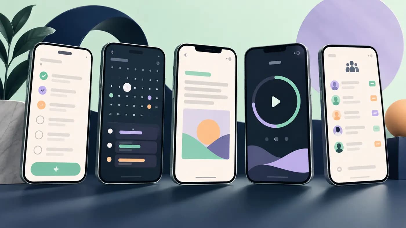
The best opening frame for a productivity app shows a specific job getting easier, not a wall of features or a vague promise to "be more productive." Below are five illustrative screenshot storyboards for task, calendar, notes, focus, and team apps. They are original editorial examples, not measured winners or reproductions of existing apps. Put real in-app UI under each caption, keep the first message understandable at small size, and show only capabilities your product actually has.
These productivity App Store screenshot examples start with what Apple actually displays: up to three screenshots or previews may appear in search, depending on the layout. That makes the opening frames especially worth checking, but it is not a guarantee that three images always show. Apple's search guidance and asset best practices are our basis for prioritizing a clear promise and genuine app imagery.
First, choose the job your app really owns
"Productivity" includes several unlike problems. A task manager helps capture and complete work. A calendar coordinates time. A note app stores and retrieves thinking. A focus timer protects attention. A team tool clarifies ownership. One screenshot set that tries to say all five at once usually says none of them memorably.
Write a one-sentence positioning statement before laying out a frame: "For [person], our app helps [specific task] by [real capability]." Then choose a real screen that proves it. Do not put a feature in the caption just because the UI prototype could someday support it. Apple's App Review Guidelines, section 2.3.3 say screenshots should show the app in use, not merely title art or a splash screen.
| App type | Useful first-frame question | UI proof to show |
|---|---|---|
| Tasks | "What do I need to finish today?" | A prioritized Today view with real task hierarchy |
| Calendar | "Where can this meeting fit?" | An actual scheduling or availability view |
| Notes | "Can I find that thought again?" | A genuine capture-and-retrieve flow |
| Focus | "How do I protect one work block?" | The live timer or focus session UI |
| Team | "Who owns the next step?" | A real shared task or handoff view |
These are example messages, not tested copy. Substitute your product's real audience and differentiator.
Capture the proof before writing the caption
Build a small capture inventory: the user job, the exact screen that demonstrates it, the product state needed to reach that screen, and the claim you can safely make. This prevents a familiar failure: a compelling headline is written first, and the designer later discovers that the app has no screen that proves it.
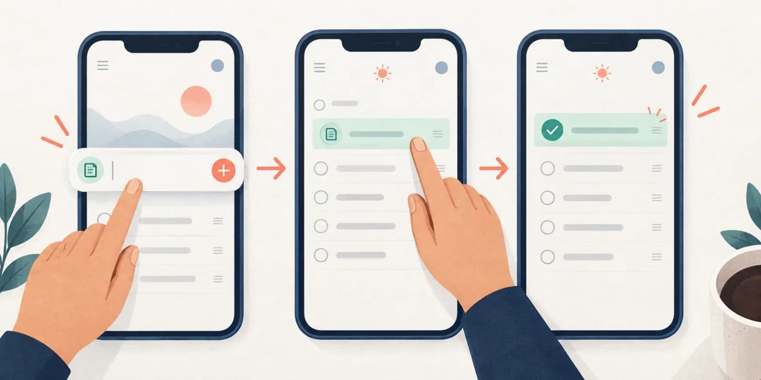
Consider an illustrative task app. A quick-add screen proves capture; a Today list proves prioritization; a completed item proves a finished action. Three screen states are stronger than three recolorings of the same list. If the release has no completion history, do not invent a success dashboard for the fourth frame. Choose another authentic proof point.
Record the build and locale used for each capture. Prepare demonstration data that looks plausible but contains no real user names, project titles, or client details. For team tools, verify role permissions: a screenshot taken from an admin account may show controls an ordinary buyer will never see. These checks are part of truthful visual storytelling, not a special Apple-required template.
Example 1: a task manager that clarifies today
Frame 1: "Know what matters today." Show a real Today screen where priority is visually clear. Avoid displaying 40 tiny tasks just to prove the app is powerful.
Frame 2: "Capture a task before it disappears." Use a real quick-add flow if it exists. If the app needs several taps, don't imply one-tap capture.
Frame 3: "Turn a project into next steps." Show the actual project breakdown, not a decorative checklist illustration.
Frame 4: "See what's done." Show a completed-state or progress view only if the product truly has one. This gives the sequence an outcome, not just another input screen.
This sequence suits an individual planning tool. If your app is specifically for a team, ownership and handoff may deserve the first frame instead. Our first-versus-second screenshot guide explains why the sequence itself is a design choice.
Example 2: a calendar that removes scheduling friction
Frame 1: "Find time without the back-and-forth." Show availability or meeting proposals in the real app. That headline works only if the app genuinely handles scheduling.
Frame 2: "See your week at a glance." Show a legible weekly view, with enough context to prove it is a calendar, not a generic phone mockup.
Frame 3: "Keep commitments in context." If the app connects notes, travel time, or reminders, show the exact linked UI and say which one. Avoid claiming integrations the user must pay for unless the paid status is clear.
For a plain calendar whose strength is speed or visual calm, a scheduling claim could mislead. "Plan your week without the clutter" might fit better, if the shown screen supports it.
Example 3: a notes app that makes retrieval the hero
Many notes screenshots show an empty editor. That proves almost nothing. Build a sequence around the moment the user needs the note again.
Frame 1: "Find the note you need." Show a real search, tag, or organization screen with readable results.
Frame 2: "Capture an idea in the moment." Show the actual capture UI and supported input type. Don't show a voice transcription if the app only handles text.
Frame 3: "Keep related ideas together." Show a real link, notebook, folder, or collection view. Explain what structure the user controls, rather than relying on a complex UI screenshot alone.
If search is weak but capture is excellent, lead with capture. The point is to show the strongest true benefit, not to copy this order rigidly.
Example 4: a focus app that earns its calm aesthetic
Frame 1: "Make room for one focused session." Show the running timer or session setup; otherwise the serene background is just decoration.
Frame 2: "Keep interruptions out of sight." Only use this if the app actually suppresses or manages interruptions. If it merely reminds users to mute notifications, say that instead.
Frame 3: "See your sessions add up." Show authentic history or a progress view, without implying a scientific productivity improvement you haven't measured.
This category benefits from uncluttered layouts, but the UI still needs to be visible. A giant headline over a microscopic timer is a weak proof frame. See our screenshot typography guide for practical sizing checks.
Example 5: a team app that makes ownership obvious
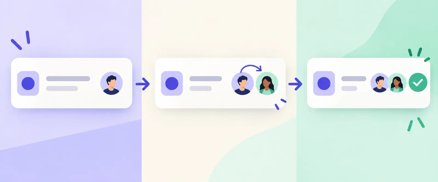
Frame 1: "Know who owns the next step." Show a real shared task with an assignee and due state.
Frame 2: "Move work without losing context." Show the actual handoff or status-change UI.
Frame 3: "Catch blockers early." Show a genuine alert, comment, or dashboard state if the app supports it.
A team listing must be careful about identities and confidential data. Use consented or properly anonymized demonstration content, and don't make the fake data so perfect that it conceals how the product works. The caption should explain the workflow to a new buyer who has never seen your internal terminology.
Turn the examples into a five-frame set
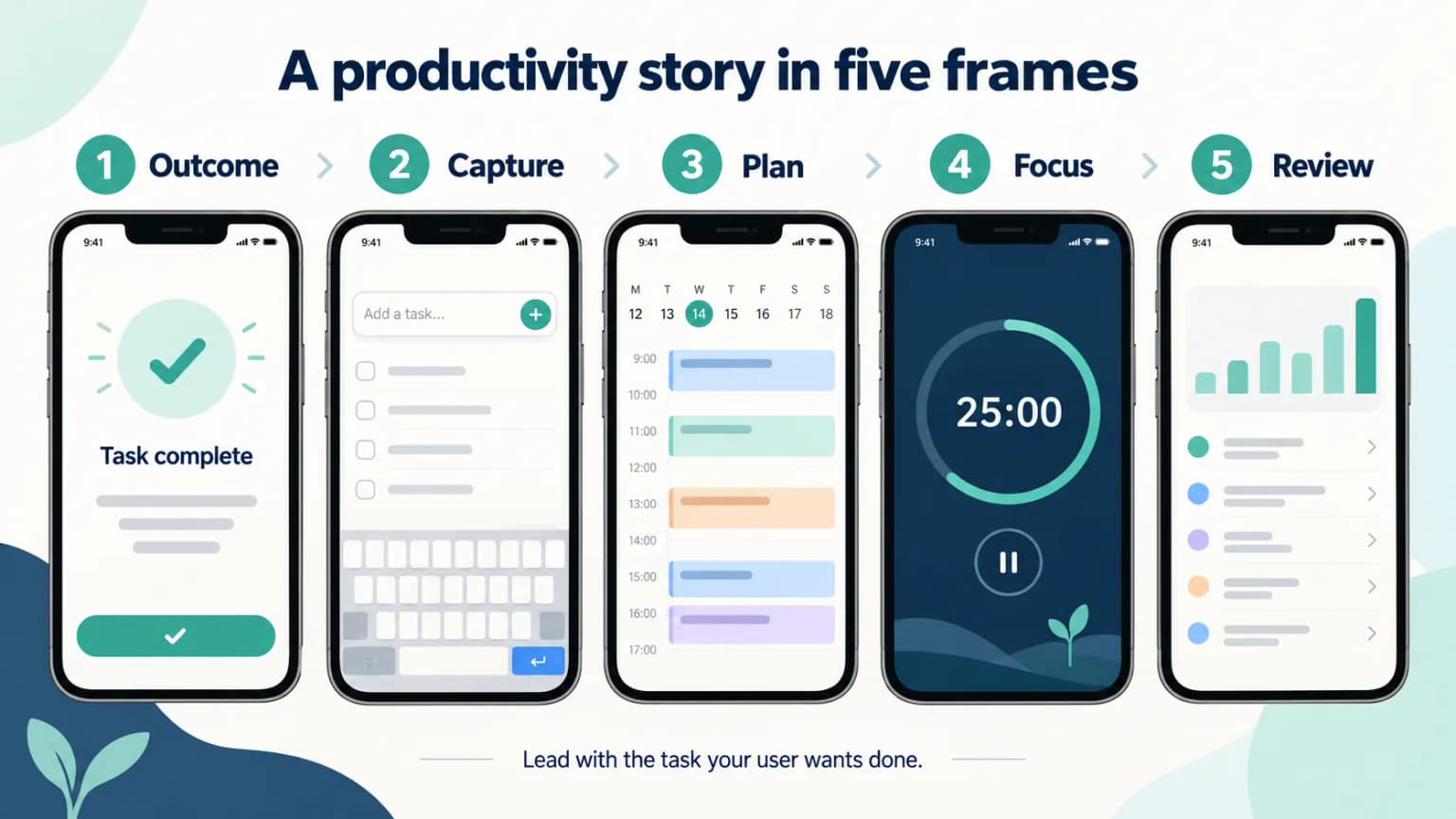
Use this order as a starting storyboard: outcome → core action → differentiator → objection answered → reinforcement. The middle frames can change based on your audience. For example, a team app may need to show permissions before a progress dashboard; a note app may need search before capture.
Run three checks on the exported set. First, hide frames two through five: is frame one understandable alone? Second, view all frames at the small size a user sees in search or on a phone: is the copy still readable? Third, remove the captions: do the UI captures prove the claim or contradict it? If a frame only works because of a paragraph of overlay text, rewrite it.
Apple allows one to ten screenshots per applicable device slot in accepted JPG/JPEG/PNG sizes, without alpha. If the app runs on iPad, plan that set as well. Use Apple's current screenshot specifications, not dimensions copied from an old template. More frames do not automatically make a stronger story.
Give the set a ten-minute clarity review
Print or open the exported frames at the size a buyer is likely to see, then ask a reviewer unfamiliar with your app to describe the job, the first action, and the distinguishing feature. Do not explain the UI while they look. Note which frame caused a wrong guess. If the person says "I think this is a habit tracker" about your calendar app, the problem is not merely the shade of blue.
Next, check for repeated claims. If frames two and three both promise "stay organized" over nearly identical list screens, replace one with a real workflow consequence: a found note, a scheduled slot, or an assigned next step. Finally, check the screen order without the overlay copy. Genuine UI should still support the story. This short editorial review does not estimate conversion; it identifies avoidable ambiguity before a formal test.
Test a message, not a decorative variation
When enough eligible traffic exists, Apple's Product Page Optimization can compare a new default-page treatment with the original. A useful hypothesis might be: "Showing the Today view before the project board helps new task-app visitors understand the core use." That is more interpretable than changing the background color, copy, and screenshot order at the same time. Our A/B testing guide covers what Apple's test can and cannot tell you.
ScreenFast is our product. Its screenshot generator can help explore design directions after a free audit. It cannot verify that your featured capability exists or that your example data is safe to publish. Use it to develop visuals, then review the actual app captures, claims, and exports yourself.
Methodology
We created the five fictional storyboards for this guide and checked the governing display and asset rules against Apple's live developer pages on 2026-09-24. They are not screenshots of named apps, customer case studies, or results from a controlled conversion test. Their purpose is to make the relationship between caption and genuine UI concrete. We do not claim that any exact line above will outperform your current set.
The added task and team visuals are fictional editorial sequences, not captures of named apps or measured winning layouts.
FAQ
How many screenshots should a productivity app use?
Apple permits one to ten per applicable slot. Use enough to explain the main job and important proof without repeating the same claim. A coherent five-frame draft is a useful editing exercise, not a mandatory count.
Should the first screenshot show the home screen?
Only if the home screen clearly proves your strongest benefit. A search result, Today view, or scheduling action may explain the app faster. Still show genuine in-app UI.
Can I show a conceptual UI mockup?
Do not present an invented feature or misleading state as something the released app can do. Use real app captures and honest annotations. Apple's review rules require metadata and imagery to represent the app accurately.
Do three screenshots always appear in App Store search?
No. Apple says up to three screenshots or previews may appear depending on the search result layout. Design for a strong first frame and an understandable set, not a fixed search carousel.
Are these real-app examples?
No. Every storyboard on this page is an original editorial illustration. Adapt it only if the wording and UI match your actual product.
Last updated: 2026-09-24.