Figma vs Canva for App Store Screenshots: A Practical Choice
TL;DR: Use Figma if your app design already lives there and you want precise, reusable layout control. Use Canva if a page-based marketing workflow suits the person making the assets. Both still need exact dimensions, real UI and final export checks. Test a long headline and one revision before choosing; those reveal more than the template gallery.
Figma vs Canva for App Store screenshots is not a contest between a professional tool and a beginner tool. It is a choice about who will maintain the files and how much control the project needs. A tool that feels familiar can save hours, but familiarity alone does not guarantee a submission-ready image.
This guide compares the work around the screenshot: canvas setup, editable text, reuse, localization and PNG export. It also gives a fair test using identical app captures. We do not claim timed results from paid accounts or that one editor creates an install lift by itself.
ScreenFast owns this guide and offers an AI-led alternative. That route is explained near the end with its limits, rather than treated as a replacement for every manual design workflow.
The useful difference: design system or marketing pages
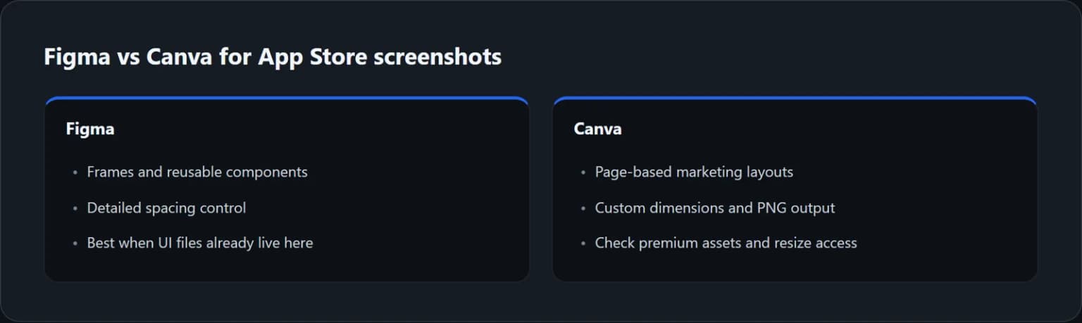
Figma is a natural choice when the app's UI files, colors and components are already part of the team's design system. You can build a screenshot layout with a stable type scale and reusable elements, then keep the relation between panels under close control.
Canva is a natural choice when the work belongs to the person who also makes launch graphics, newsletters and social assets. A page-based layout workflow can make that handoff easier. You should still separate the store canvas from the other marketing formats.
Neither choice removes the creative brief. You need to decide which user outcome leads the sequence and which screen proves it. A template can arrange those elements; it cannot make an unsupported promise true.
Start with the person who will revise the files next month. If they can make a safe text change in the chosen tool without rebuilding the layout, you have a more durable workflow. The first polished export is only part of the decision.
Set exact dimensions before styling
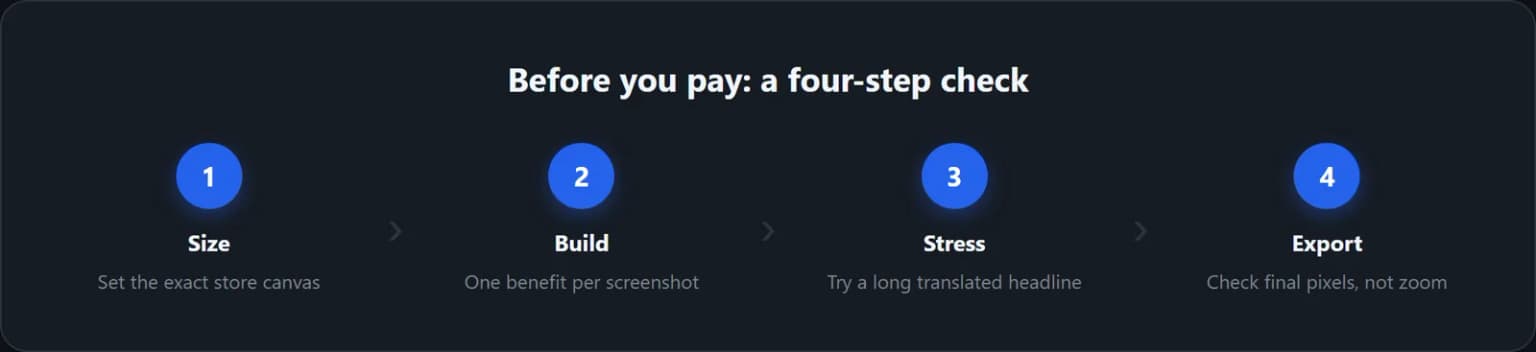
Use the current Apple screenshot specifications to identify the slot you are preparing. Then set the canvas in pixels. Do not begin with a social template and stretch it until it resembles a store panel.
Figma frames give you an explicit container for each output. Name frames by platform, locale, size and order. That makes later batch work easier to inspect. A name such as iphone-en-01-main-benefit is more useful than Frame 42 copy.
For Canva custom dimensions, use the required pixel values when creating the design. Keep creating a correctly sized canvas separate from resizing an existing design. Canva's resize documentation lists plan eligibility and usage limits for Magic Resize; do not assume every resize shortcut is free.
In both tools, confirm the final file dimensions after download. Export scaling can change the pixel count even when the editor canvas is correct. A 2x export of an already full-size canvas is not automatically better for a store upload.
What Figma's export documentation confirms
Figma's static export guide says static export is available on any plan, subject to file permissions and owner restrictions. You can export selected content and set the output configuration.
For a store panel, export the intended frame, not a small nested object or an accidental slice of the layout. Check the background and crop. If the image contains a transparent area where a solid canvas was intended, fix it before submission.
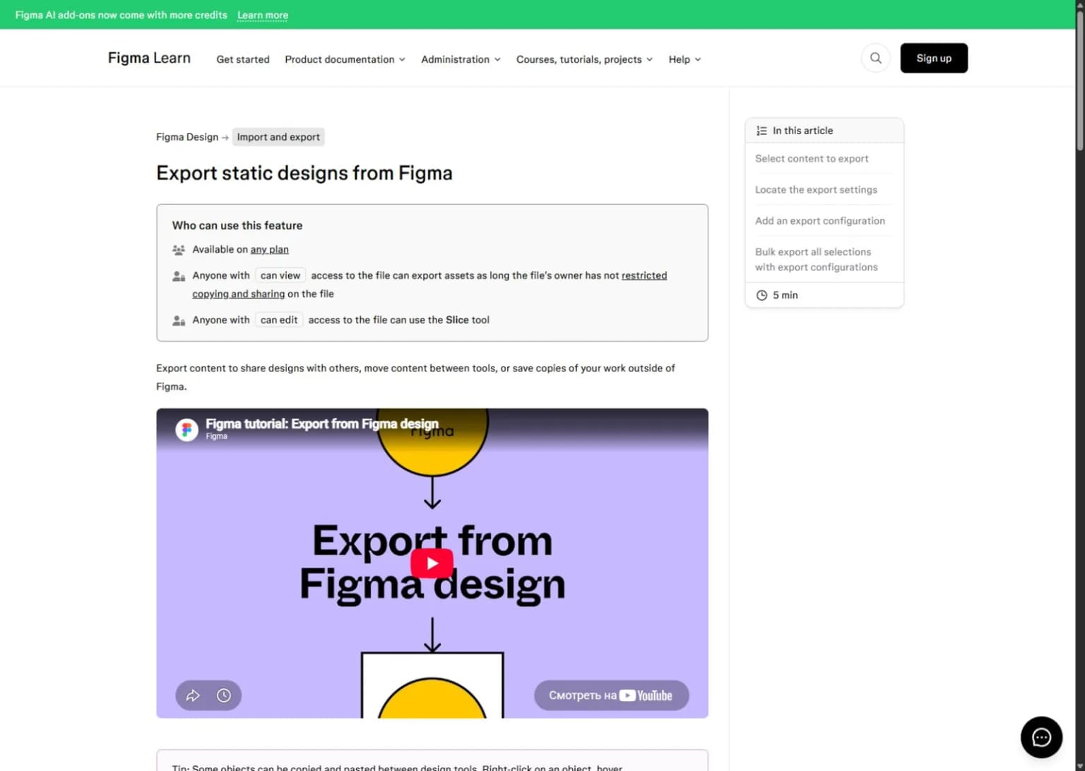
Official documentation captured during the September 8 review. This is not a screenshot of an app project we tested inside Figma.
Keep the editable source. PNG output is a final raster file, not a portable replacement for the layers, components and text in the project. If another person needs to revise the design, give them the appropriate source access and document any fonts or assets they need.
This is especially important for app updates. Editing flattened text inside a PNG is a poor substitute for changing the original headline and exporting again. Treat the image as an output of the source, not the source itself.
What to check in Canva before you commit
Canva supports image-based design and PNG downloads, but the exact workflow can depend on the assets and features you choose. A free-looking template may contain premium elements. Check the actual download step with your intended design before building a large set around it.
Do the same for resizing. A manual correctly sized design and a paid automatic resize feature solve related but different jobs. If you need several device sizes every release, test the amount of manual work without assuming a shortcut is included in your plan.
Keep the app capture as the proof inside the layout. Avoid replacing it with a generic phone mockup that makes the product less clear. Check the crop after every size change, particularly when the original interface has important controls near an edge.
For client work, verify the license for templates, photos, fonts and other assets. The ability to edit or download something is not a complete answer about every form of redistribution. Confirm what the final handoff must include before promising editable source files.
We do not quote a single universal Canva paid price here. Region, billing mode and plan type can change the total. The purchase question is whether the specific paid features remove enough real work to justify your current checkout amount.
Build a three-panel test with identical content
Choose a real app and three captures. Use the same benefit headlines in both tools. This prevents a better creative idea in one test from masquerading as a better editor.
The first panel should show the main outcome. The second should show a useful action. The third should add proof or answer a likely objection. Avoid three versions of the same vague claim, even if the backgrounds differ.
Build a simple visual rule: one headline position, one margin system and a stable device scale. Then allow the crop to change when the UI needs it. Consistency does not require every panel to be a clone.
Reduce the exports to a realistic thumbnail size and compare them side by side. Can you read the headline? Can you tell which part is actual app UI? Does each image add a new reason to care?
Only after that test should you add decorative effects. A shadow, gradient or tilted frame should support the message. If removing it makes the app easier to understand, the effect is not doing useful work.
The revision test is more revealing than the first design
Change the longest headline to a phrase that is roughly a third longer. This is a deliberate stress test, not a claim that every translation expands by that amount. Watch the line breaks, spacing and relation to the phone.
Next, replace a sparse capture with a denser one. Does the template still leave enough room to read the UI? Can you change the crop without disturbing the rest of the panel? These are the edits a real app release will force on the project.
Finally, change a shared product term across the set. In Figma, a well-built reusable structure can help keep changes consistent. In a page-based workflow, clear source copy and disciplined duplication become especially important. Test the actual project structure rather than relying on a broad claim about either tool.
Record the manual steps. Do not invent a stopwatch result; simply note where the work repeats and where errors can creep in. The better choice is often the one your team can revise safely, not the one that made the first panel fastest.
Localization needs a source of truth
Localization is not just pasting translated text into a box. You need consistent product terms, a message that makes sense in the market and a final image with readable line breaks. Text inside the app capture may also need to change.
Keep the approved captions in one source document. Track which language versions reflect the latest product message. If a paid feature changes name, update the source before touching individual layouts.
Use a longer reviewed translation early in the design test. Do not solve every overflow by shrinking the font. Sometimes the right fix is a shorter phrase, a different line break or a larger text region.
Check every exported locale as an image. Editable text that looks correct in the project can still wrap poorly in the final file. A fluent review matters for important markets, and no design app removes that need.
Our screenshot localization guide covers that process. If manual locale work becomes the bottleneck, a store-focused editor may be worth comparing with both Figma and Canva.
A practical scorecard for your choice
| Criterion | Give Figma more weight when... | Give Canva more weight when... |
|---|---|---|
| Existing source | The app UI and design system already live in Figma | Marketing assets already live in Canva |
| Detailed control | You need reusable components and precise layout rules | A page-based layout is enough for the work |
| Maintainer | A designer or developer will own revisions | A marketing collaborator will own revisions |
| Multiple formats | You can maintain the needed frame variants | You have tested the required resize path and plan |
| Handoff | Source access and design structure are clear | Source access and asset licensing are clear |
Do not total the rows mechanically. One mandatory requirement can outweigh several nice-to-have features. If the maintainer cannot safely edit the file, the workflow is fragile regardless of how many points it earns elsewhere.
For store-focused alternatives, see our best App Store screenshot generators guide. If you prefer to leave the manual Figma workflow, the Figma alternative page explains the AI-led option without pretending it preserves all the same controls.
When neither manual editor solves the real problem
Sometimes the blocker is not file production. It is deciding on a visual direction and a clear story. Opening another blank canvas does not solve that by itself.
ScreenFast starts with a free audit of your app context. Payment then unlocks ten AI design directions. The one-time option is $9.99 per app, with optional subscriptions on our pricing page.
The AI screenshot generator produces iPhone-focused native images at 1290x2796. It does not natively create iPad or Android sets, videos or direct store uploads. Its raster output is not the same as a layered Figma or Canva source with editable text objects.
Use that route for concept exploration when it fits. Use a manual editor when exact control is the priority. If you combine the two, account for the work needed to rebuild or refine a concept in a controlled source file, and check all generated text and UI.
How we tested
We reviewed current official Figma export and plan documentation, Canva's size and resize guidance, and Apple screenshot requirements on September 8, 2026. We also checked current search results for the comparison intent.
We did not run a paid side-by-side timing study or claim a measured conversion difference. The three-panel and revision tests are proposed evaluation methods. The cover and cards are editorial visuals; the Figma image is a labeled official-document capture.
FAQ
Can I make App Store screenshots in free Figma?
Figma's static export documentation says the feature is available on any plan, subject to file access restrictions. You still need the correct canvas, appropriate assets and a valid final file.
Can Canva use custom dimensions?
Yes, its design workflow supports custom measurements. Keep creating a correctly sized canvas separate from paid resize shortcuts. Check the current plan and size limits for the exact workflow you need.
Should I export at 1x or 2x?
Start from the required final pixel dimensions. If the canvas already matches them, a larger multiplier changes the output size. Inspect the downloaded file rather than choosing a multiplier because it sounds sharper.
Which is better for editable text?
Both can keep text editable in their source design. A PNG export flattens that work. Choose the source workflow that the maintainer can revise safely and retain access to it.
Are screenshot templates enough for a good listing?
No. Templates help arrange the content, but the listing still needs a clear benefit, real UI and a useful sequence. Test readability with your own captures, not just the template's demo images.
Which tool will improve conversion more?
There is no reliable universal answer. The message and final layout matter more than the editor name. Publish a clear hypothesis and measure it with relevant traffic rather than assuming the tool itself creates lift.
Last updated: 2026-09-08. Documentation reviewed on the same date.