01
Minimal and benefit-led
Best for
Productivity, utilities, finance
One promise, one focal screen, and enough empty space to stay readable in search results.
App Store Screenshot Examples
Browse design directions, understand what each pattern communicates, and build a screenshot set that sells the product before users read the description.
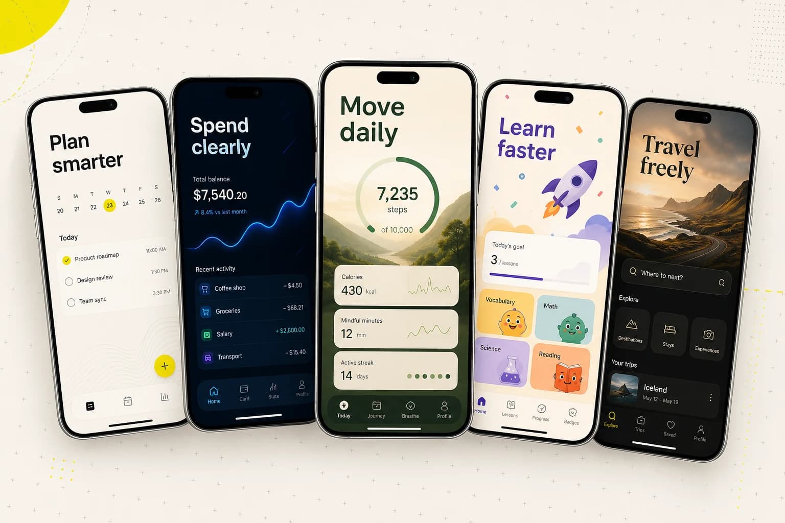
A direction is more than a background color. It changes what the first screen promises, how quickly the product is understood, and which emotional signal reaches the buyer.
Best for
Productivity, utilities, finance
One promise, one focal screen, and enough empty space to stay readable in search results.
Best for
Fintech, analytics, security
Use contrast to make the key number or outcome visible before the UI details.
Best for
Wellness, habits, lifestyle
Connect the interface to the life outcome without turning the screenshot into a stock-photo ad.
Best for
Education, games, family apps
Let character and color create energy, but protect hierarchy and avoid decorative clutter.
Best for
Travel, media, photography
Use atmosphere to sell the experience while keeping the product screen recognizable.
Best for
Apps with a clear multi-step journey
Treat the first three screenshots as one sequence: promise, proof, then the next reason to install.
Real product output
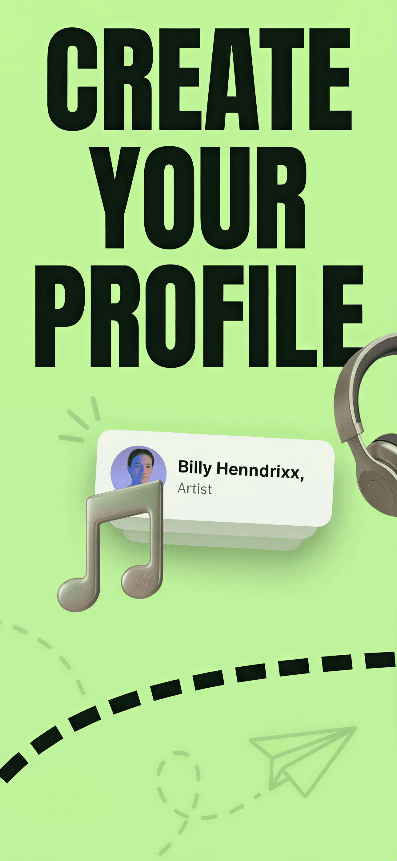
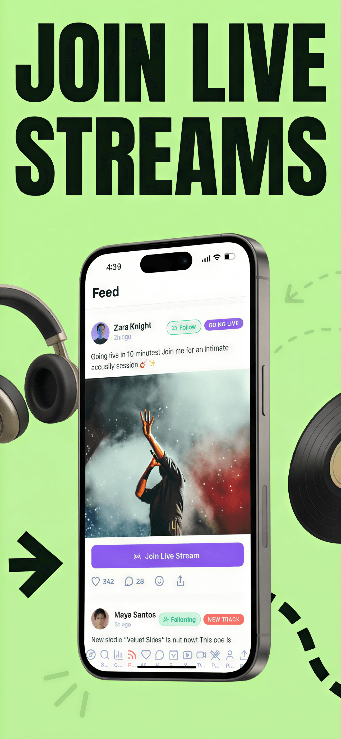
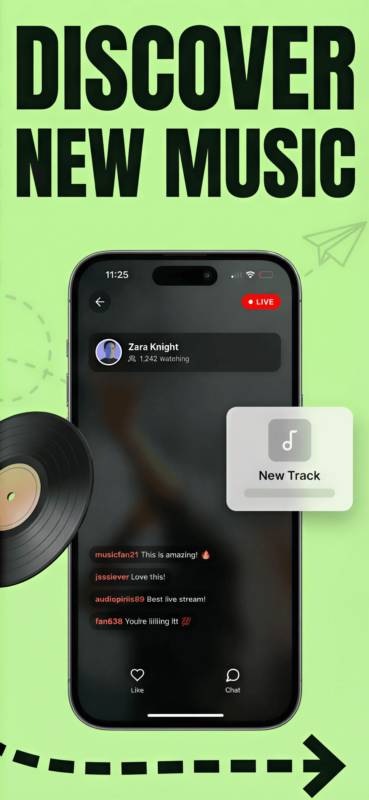
ScreenFast-generated demo set shown as a product example, not as a claimed customer campaign or conversion result.
First three screenshots
Lead with the outcome a buyer can understand at thumbnail size.
Show the product moment that makes the first promise believable.
Add the next strongest reason to install without changing the visual system.
Before you export
Skip the template hunt
Paste a live App Store URL or upload prelaunch screens. Compare ideas first, then refine the strongest one.
A strong example communicates one benefit at thumbnail size, uses real product UI as proof, and carries a consistent visual system across the set. It should be judged as a sequence, not as ten unrelated posters.
No. Device frames create context, but they also consume space. Use them when the hardware silhouette helps comprehension. A clean crop or split-screen composition can be stronger when the interface itself is the proof.
Create enough distinct directions to compare positioning, not just colors. ScreenFast generates 10 directions so you can evaluate message, composition, energy, and category fit before refining one.
Use competitors to understand category conventions, but do not copy their artwork, claims, or distinctive composition. The goal is to learn what buyers recognize while building an original visual system for your own product.