How to Create App Store Screenshots: Step-by-Step (2026)

8 min readSFScreenFast Team
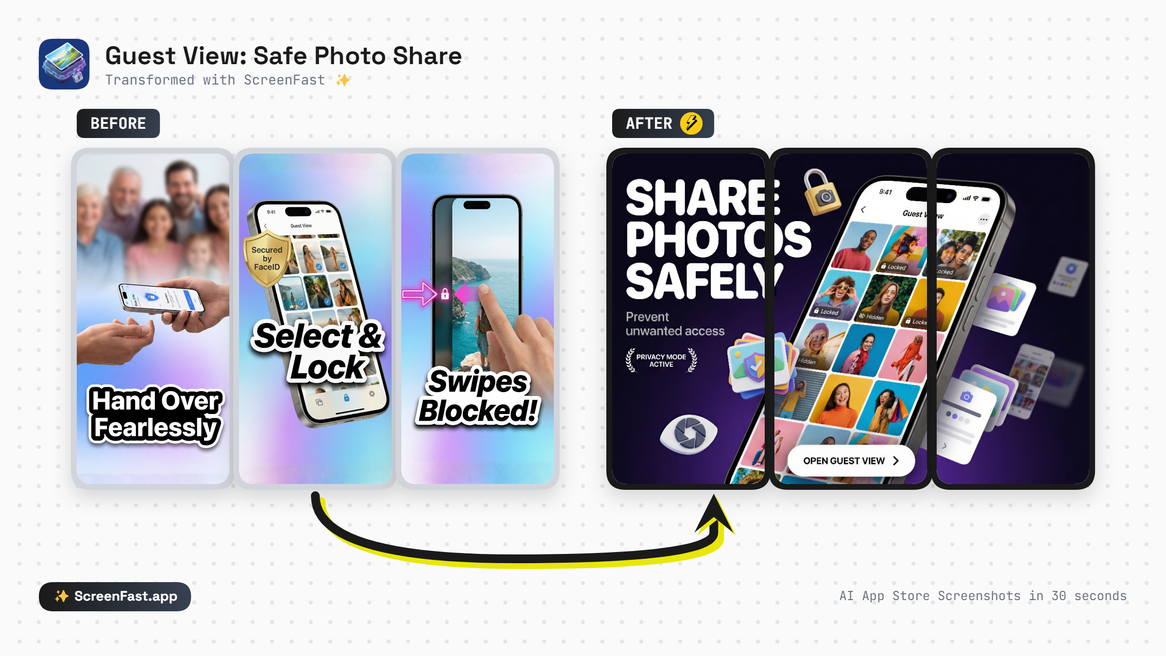
A ScreenFast workflow showing an App Store URL becoming a free audit and, after checkout, ten distinct screenshot directions.

TL;DR

To create a useful App Store screenshot set, start with the story rather than the decoration. Decide what a shopper should understand from frames 1, 2, and 3; prepare clean in-app screens; then build several genuinely different creative directions before polishing one. ScreenFast handles that workflow from either a live App Store URL or uploaded prelaunch screens: it shows a personalized audit first, then generates 10 app-specific directions after the $9.99 one-time checkout. Review every headline and UI detail, export an opaque 1290 x 2796 PNG set, and validate the winner with Apple's Product Page Optimization instead of treating the first design as final.

1. Choose the right starting point

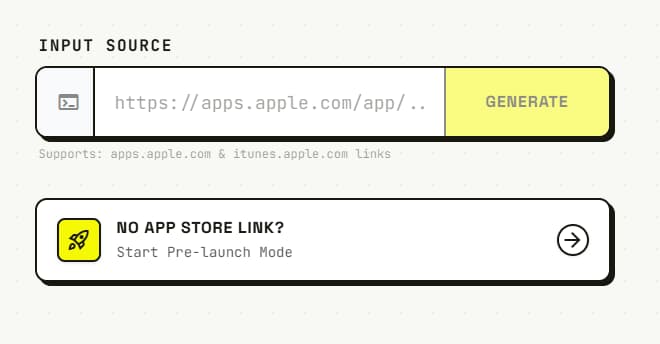
There are two ScreenFast workflows. Use the one that matches the state of your app.

Your situation Start with What ScreenFast can inspect
The app is already on the App Store Its apps.apple.com URL Existing icon, listing copy, category, and screenshot sequence
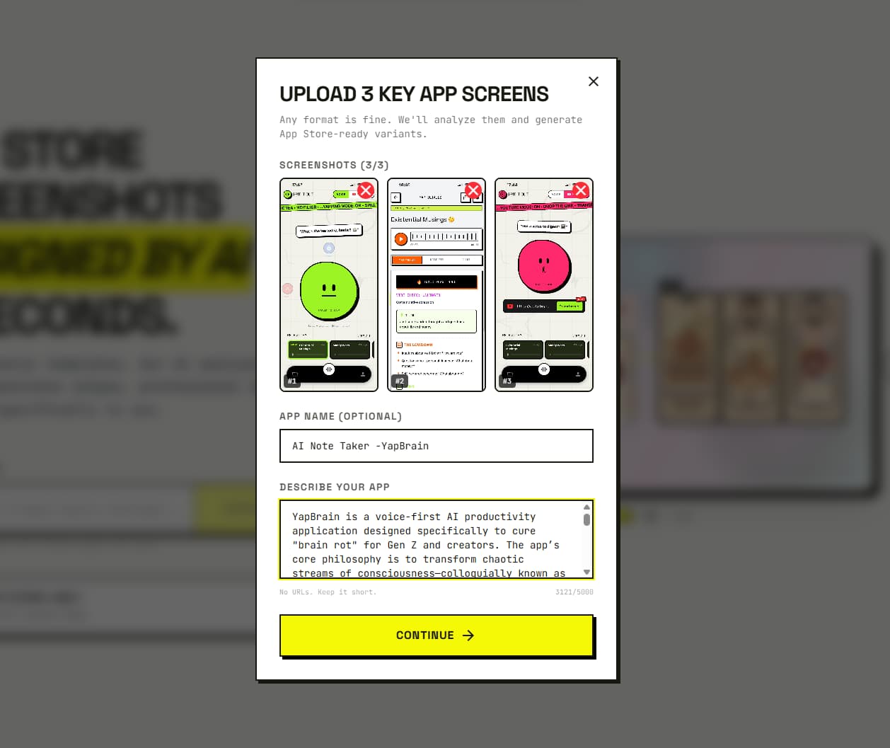
The app is not live yet Prelaunch mode Uploaded iPhone screens, app name, and your short product description

The URL route is faster when the public listing is current. Prelaunch mode is better when the App Store page does not exist yet, or when your next release looks materially different from the live version.

Do not upload mockups of mockups. Start with clean captures of the real product UI. If status bars, sample accounts, or personal data need attention, fix those before generation so every direction starts from trustworthy source material.

2. Plan the first three-frame story

Apple allows one to ten screenshots, but more frames do not repair a weak opening. Write one job for each of the first three before choosing colors or device frames:

  1. Frame 1: the promise. State the main outcome for the person who should install the app.
  2. Frame 2: the proof. Show the product screen that makes the promise believable.
  3. Frame 3: the differentiator. Explain why this app is preferable to the familiar alternative.

A budget app might use "Know where your money went," then show the transaction breakdown, then highlight automatic categorization. A running app might lead with a training outcome, prove it with the plan screen, then show adaptive coaching. This is a message sequence, not a feature inventory.

Keep headline drafts short enough to read on a small search-result card. Avoid claims that the UI cannot prove, tiny disclaimers, review stars you do not have, and prices that may change between releases.

3. Run the free screenshot audit

Open the App Store screenshot generator and submit the URL, or choose the prelaunch route and upload your source screens. ScreenFast analyzes the listing before it asks you to unlock generation.

The audit focuses on practical conversion questions:

  • Can a new visitor understand the app from the opening frames?
  • Is the visual hierarchy readable at thumbnail size?
  • Do the screenshots describe outcomes or merely label features?
  • Is the sequence repetitive?
  • Does the design feel consistent with the icon and product category?

Use the audit as a brief, not as an automatic verdict. You know the audience, roadmap, and legal constraints better than a model does. Keep findings that match the product and reject suggestions that do not.

4. Unlock 10 distinct creative directions

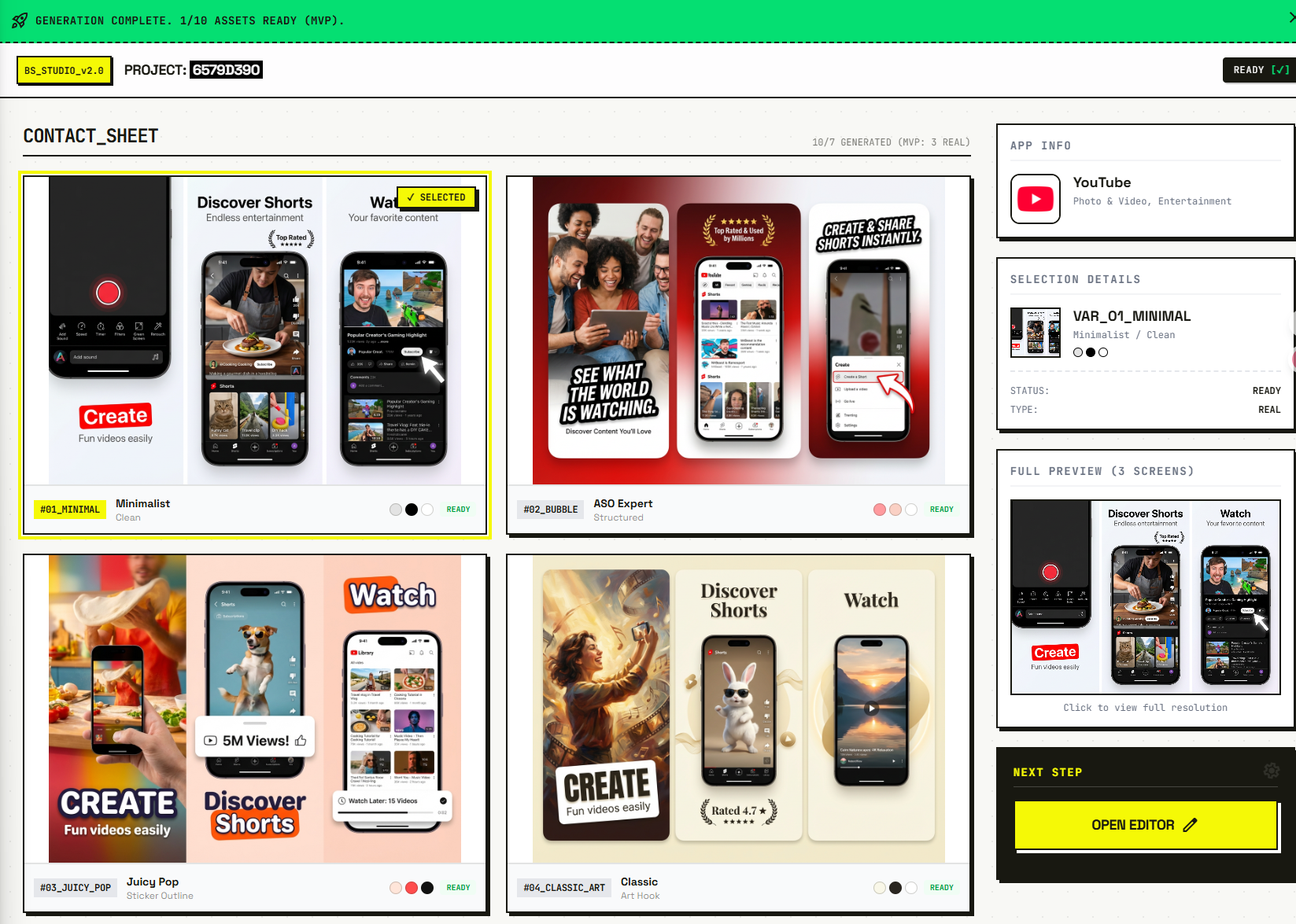
After the audit, the one-time option costs $9.99 for one app generation. A subscription credit can be used instead when you work across multiple apps. Generation starts only after checkout; the paid result contains 10 directions with different combinations of composition, background, framing, hierarchy, and visual tone.

The point of ten directions is not to fill a gallery with minor color variations. It is to make the strategic choice visible. A restrained utility layout, a bold benefit-led layout, and an illustration-forward layout can tell the same product story while creating very different first impressions.

Judge the set in two passes:

  1. At thumbnail size, remove anything whose first frame is hard to understand in two seconds.
  2. At full size, remove anything with inaccurate UI, broken text, weak contrast, or a style that conflicts with the app.

Pick the strongest direction only after both passes. Attractive at full size is not enough if the message disappears when the screenshot is reduced.

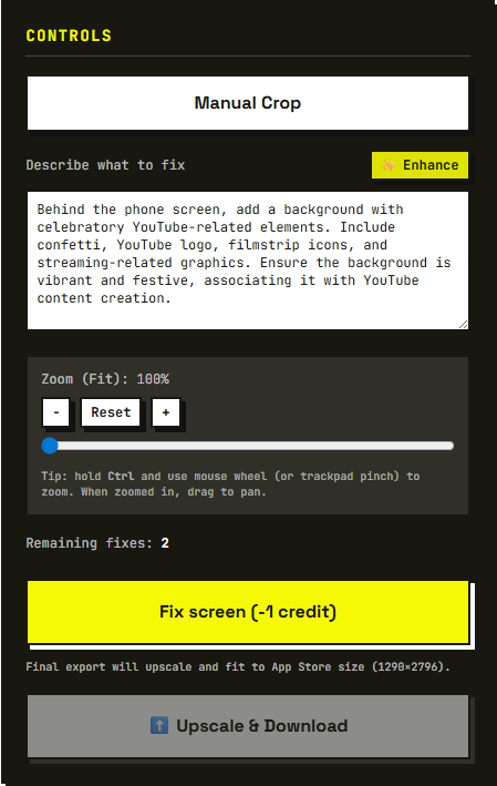
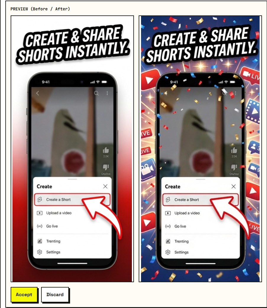
5. Refine the winning direction

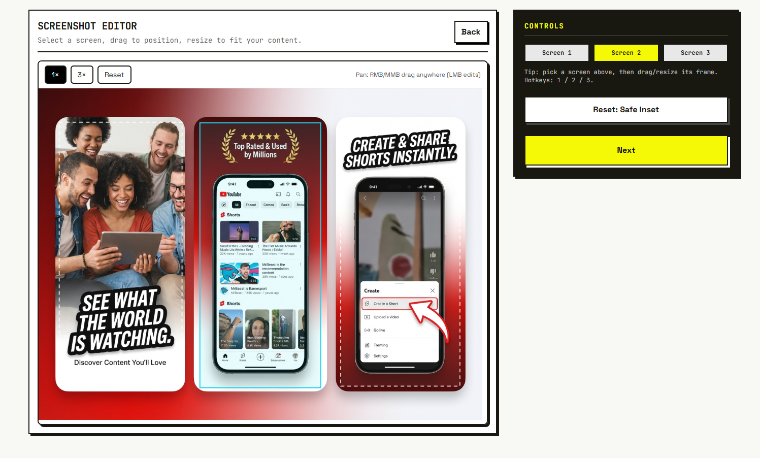
Use focused refinements rather than asking for a completely new concept each time. Good requests name one problem and one desired change, for example:

  • make the first headline shorter without changing its meaning;
  • increase contrast between the phone and background;
  • keep the UI untouched and simplify the decorative elements;
  • make frames 2 and 3 feel like one sequence;
  • reduce the device-frame size so the key product detail stays visible.

Review generated text character by character. Check names, units, prices, dates, charts, and any UI copied into the composition. AI can propose a useful visual direction, but it cannot certify product accuracy or App Review compliance for you.

6. Export an Apple-ready iPhone set

ScreenFast exports 1290 x 2796 portrait PNG files. That is one of Apple's accepted 6.9-inch iPhone screenshot sizes. Apple's current specification permits one to ten screenshots in JPEG, JPG, or PNG, and explicitly says images cannot contain alpha channels or transparency. Apple also says that when the interface is the same across device sizes, the highest-resolution screenshots can scale down for smaller sizes. Verify the current table in Apple's screenshot specifications before every major release because supported devices change.

Before uploading, check the exported folder:

  • every file uses one accepted dimension and the same orientation;
  • there is no transparency or accidental alpha channel;
  • the UI, headline, and screenshot order are correct;
  • no personal or test-account data is visible;
  • iPad screenshots are prepared separately if the app runs on iPad;
  • localized sets use reviewed translations rather than raw machine output.

If you need a dimension-by-dimension reference, use the App Store screenshot sizes guide. If you captured the source screens in Xcode, the iOS Simulator screenshot guide covers the clean capture workflow.

7. Upload the screenshots in App Store Connect

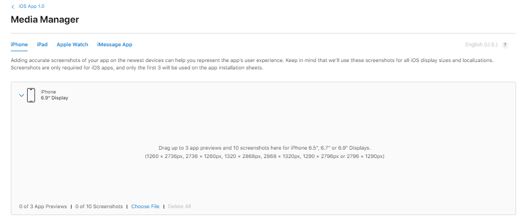
In App Store Connect, open the app version, choose the iPhone tab, and add the files under Previews and Screenshots. Apple permits custom assets for other sizes and localizations through Media Manager. According to Apple's upload guide, screenshots can be changed while the version is in an editable status; after approval, updating them requires a new version.

Upload in narrative order. Reopen the preview and inspect the first three as a group. A common final-stage error is producing good individual frames but arranging them so the promise, proof, and differentiator appear out of sequence.

8. Test the concept instead of guessing

For a live iOS or iPadOS app, Apple's Product Page Optimization can compare the original product page with up to three treatments containing alternate screenshots, previews, or icons. Apple reports conversion-rate lift and confidence in App Analytics. Its current guidance recommends waiting until a treatment is declared better or worse with at least 90% confidence before applying it. See Apple's Product Page Optimization overview and test-treatment instructions.

Test a meaningful hypothesis. Changing only a background shade may produce a clean experiment but teach you very little. Comparing three different opening promises can reveal which customer outcome actually drives installs. Keep the rest of the listing stable while the test runs, and document the dates so a release, featuring event, or paid campaign does not get mistaken for screenshot lift.

Common App Store screenshot mistakes

  • Designing before writing the story. The result looks polished but says nothing.
  • Treating all 10 slots as equally important. Put the clearest promise first.
  • Using tiny text. Judge at realistic search-card size, not only on a desktop canvas.
  • Letting generated UI pass without review. One invented number can undermine the whole listing.
  • Uploading transparent PNGs. Apple's current specification disallows alpha channels.
  • Calling a design a winner without a controlled test. A before-and-after trend is not proof by itself.
  • Forgetting localization. Text expansion and right-to-left layouts need a visual review, not just translation.

Frequently asked questions

Can I create App Store screenshots before my app is published?

Yes. Use ScreenFast's prelaunch route, upload your real iPhone screens, and add the app name and a short description. A public App Store URL is not required.

Does ScreenFast show a free generated design before checkout?

No. The free step is the personalized screenshot audit. The 10 visual directions are generated after the $9.99 one-time purchase or after using a subscription generation credit.

How many App Store screenshots should I upload?

Apple allows one to ten. Use as many as needed to explain the product without repeating yourself. Make the first three a complete promise-proof-differentiator sequence, then use later frames for secondary workflows, trust, integrations, or audience-specific details.

Are 1290 x 2796 screenshots accepted by Apple?

Yes. It is one of the accepted portrait sizes for the 6.9-inch iPhone display in Apple's current screenshot specification. Check the official table before release because the supported device list can change.

Can the same screenshot set be used for iPad?

No. iPad has separate required screenshot sizes and usually needs a layout that respects its different aspect ratio and information density.

What should I test first in Product Page Optimization?

Start with a high-impact, interpretable hypothesis: a different first-frame promise, visual hierarchy, or creative direction. Avoid changing every element at once, because even a winning treatment will not tell you what caused the result.

The practical workflow

Write the three-frame story, submit the app or prelaunch screens, use the free audit to tighten the brief, unlock 10 directions, eliminate weak concepts at thumbnail and full size, refine one, export, upload, and test. That sequence separates strategy from production and makes the final design easier to evaluate.

Start with the free screenshot audit. No generated design is shown before checkout; the paid step unlocks the complete set of 10 app-specific directions.

Ready to ship better App Store screenshots?

Start with a free screenshot audit, then unlock 10 app-specific design directions for $9.99.

Audit my screenshots